Tuesday, 8 December 2015
Digital 3D Potential and the Limitations 4: Environments
With digital 3D, environments are incredibly easy. A lot of the things you have to learn and practice drawing extensively can be done with a click of a button. Lighting and glowing objects in particular are extremely easy to create, and with the huge amount of settings and options. Drawing perspective no longer is an issue, as you make the objects and then move the camera around to get the perspective. Furthermore, texturing couldn't be easier. Maya has a few built in textures that can be overlayed on top of each other, and just like every other ability in Maya, there are no end of settings to make surfaces more or less reflective, more or less transparent, the possibilities are endless.
Digital 3D Potential and the Limitations 3: The skill set switch
With 2D animation, the ability to draw is definitely a necessity, (perhaps not so much for graphic animation) and an understanding of movement is also required, but with digital 3D the skill requirements seem to turn around.
With it being 3D animation, the drawing turns into sculpting, which, though is helpful to have some as a guide, doesn't require any drawing, though less tactile than working clay or over real world sculpting materials, the concept is still the same, mould until it looks like you want it. Then to animate with your 'sculpture' you need to rig, which is less artistic, and a lot more based in computer and programming logic as it isn't open as much to interpretation. There is a right way, and a lot of wrong ways to rig a model.
At this point you reach animating. I implied earlier that an understanding of movement is not required. This is a false statement, however with the graph editor, and using key frames, the whole process is much easier. If a movement doesn't look right its a simple matter of adding more or less keyframes, and playing around in the graph editor. This isn't better or worse than 2D animation, just different.
Digital 3D Potential and the Limitations 1: The uncanny valley
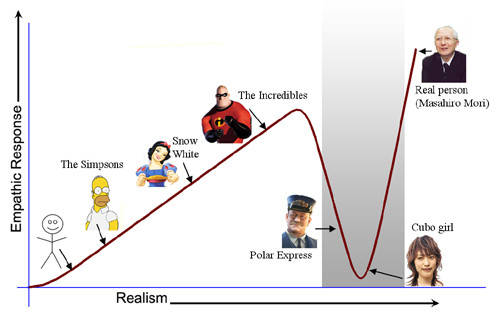
Originally the uncanny valley was conceptualised for robotics in the 70s by Masahiro Mori, a roboticist. The theory is, the more something is designed to be human, the higher the chance of it being creepy.
It began being applied to film after the release of Tin Toy by Pixar. The baby character is horrifying, and after huge negative reactions from viewers, the concept of the uncanny valley began being taken seriously in the film industry.
As technology has been developed to make more and more realistic models and movement for animation, the more animators have falling into the uncanny valley, usually because an aspect of real people has been overlooked (usually the eyes, as evident in games such as L.A. Noire, and films such as The Polar Express)
Digital 3D Potential and the Limitations 5: VIDEOGAMES
My personal favourite form of Digital animation is videogames. Not all videogames are 3D, but they are all digital, and even the simple ones often have an element of 3D in them. As a medium, videogames are huge, and the potential for storytelling is also huge, its a chance for the audience to become involved in the story, not just be an observer. It also opens up new avenues with storytelling, with different methods, for example, in open world games such as Fallout 3 or Skyrim, you can come and go as you please, the entire story can be changed by you and have maps 1000km by 1000km. This does mean a lot more work when animating, and a lot of limitations on texture quality and animation quality, just to fit it all onto one disk, but with the progression of hardware, quality of videogames are no longer limited by space as much.
Digital 3D Potential and the Limitations 2: Cost
With digital 3D animation, decent computer hardware is a must, particularly if the scene and/or characters are detailed, then the more intense it is going to be on your hardware. This can be quite expensive, with high end graphics cards being in the £400 area, for a machine that can render scenes quickly with minimal crashing you'd probably end up spending over £1000 on a decent rig. Compared to 2D animation which takes a lot less time to prepare and render, the hardware doesn't have to be as expensive.
Furthermore, most 3D animation program licenses are extremely expensive, for example a Maya license costs £3550, which is a lot more than your average pocket change. Luckily there are ways around this, such as blender, a free open source animation program which has all of the same capabilities as maya, though you would still need a decent computer to run it from.
Though the question of price is always an issue with most forms of animation, even pencils cost money, they certainly won't set you back as much as a brand new computer with maya.
Character and Narrative 13: Post Production and Audio
Now that we have animated, and finally finished rendering the animation, its time for post production. Katy has taken a leading roll for this part as she put the entire animation together, checked the timing, added a title and credits, and the underwater background, while i made the speech bubbles and added an animated filter to the underwater scene. After this we added our sound. Katy recorded some herself for the mermaid, and i found some computer sounds online for the robots speech (because the dial up noise i had already edited wasn't enough), I also had a look through the BBC sound library and the hanna barbera SFX collection that college has for ocean and underwater ambient noises, but Katy found some more appropriate sound effects online so we used those instead. This was by far the easiest section of this project, i could happily edit it all again. We did a final check with one of our peers, because we weren't sure about a certain sound bite at the end, which he approved of. Its nice to not be rendering on the day of submission again, our time management has been very good.
Character and Narrative:12 Animating
Today I got around to animating in maya using my model, my scene and Katy's model, and right now i am finding it thoroughly frustrating. Both models have so much wrong with them, luckily this isn't as much of a problem with my model because he doesn't move a whole lot, however Katy's model has a huge ammount of problems, i can't turn her character in certain directions because she hasn't painted the influence weights very well, furthermore, she showed me a shot that she had animated and it felt like she hadn't payed any attention to shot framing. I feel like at this point, the collaboration aspect of the project is what is causing me the most stress and anxiety, allowing the project to be in someone elses hands as well. In truth, the problems i have found with Katy's work i feel would probably be reciprocated when Katy works with my model as well. Otherwise animating is quite easy when the model is cooperating with you, some scenes of the animation are starting to look very nice.
Sunday, 22 November 2015
Character and Narrative 11: Modeling and Rigging the Robot
This Robot has been giving me no end of trouble, when modeling the eyes i had trouble making them look inorganic, as the smoothing and unevenness of me inserting edge loops couldn't do it. This is when Matt showed me another technique using booleans to use one object to cut out another object, which looked so much better.
The difference in the model compared to Matt's tutorial model definitely was an added struggle for me. Because they were quite different i lost a lot of confidence, which in turn made me work less effectively. Furthermore i am not looking forward to getting to painting influence weights because of my character being completely mechanical i want almost all of the segments in the legs head and body to not stretch at all, which is very different to the smoothed out painting for the tutorial model. Before i even get to that though i have to get past joint orientation and constraints, which is something i have no idea how to do effectively.
I am very behind schedule and unsure how to progress currently.
I dislike Maya.
Character and Narrative 10: Presentation and feedback
Today me and Katy gave our presentation. We showed all the work we had produced up to this point, unfortunately i didn't get to show some of my proof of concept work for the sea and the water caustics in maya due to a technical screw up on my part.
I got a lot of feedback that was useful, particularly with the water. Matt said that it would be best to set a deadline to decide on, and to look at some other examples of water such as the water in Pingu for the surface, which looks promising and when i have modelled the character and boat i will see how it looks. It was also suggested to look at The Deep by Pes for underwater effects, it has less caustics and more ocean particles. Matt also mentioned about my character design that i should have look at a wider range of examples, rather than just robots to also look at things like switches and metal bins. Finally Sara mentioned that she didn't think the characters fit together. She suggested that we should draw each others designs then swap back and forth till they look closer to each other. I wasn't sure how to feel about this advice because they will look similar because they will both be 3D but also they weren't supposed to look remotely similar in the first place. We did take this advice on board though and tried out drawing each others characters.
I got a lot of feedback that was useful, particularly with the water. Matt said that it would be best to set a deadline to decide on, and to look at some other examples of water such as the water in Pingu for the surface, which looks promising and when i have modelled the character and boat i will see how it looks. It was also suggested to look at The Deep by Pes for underwater effects, it has less caustics and more ocean particles. Matt also mentioned about my character design that i should have look at a wider range of examples, rather than just robots to also look at things like switches and metal bins. Finally Sara mentioned that she didn't think the characters fit together. She suggested that we should draw each others designs then swap back and forth till they look closer to each other. I wasn't sure how to feel about this advice because they will look similar because they will both be 3D but also they weren't supposed to look remotely similar in the first place. We did take this advice on board though and tried out drawing each others characters.
Character and narrative 9: Sound design
For the sound design we decided that Katy would pick the background noise and the sound that the mermaid would make (we didn't want any characters to speak) while i would decide on the noises that the robot would make.
I started by experimenting with the old-school dial up internet noise as there is a lot of variation in sounds that i thought could show a few different emotions, but it didn't quite have the range of sounds i think i might need, so i will look at other computer generated noises and pick a few, then in post production i will play around with which sounds sound the best.
I started by experimenting with the old-school dial up internet noise as there is a lot of variation in sounds that i thought could show a few different emotions, but it didn't quite have the range of sounds i think i might need, so i will look at other computer generated noises and pick a few, then in post production i will play around with which sounds sound the best.
Character and Narrative 8: Sea Tests
To prepare for the making on the animation i tried out a few different ideas for water.

I started with a plane with a dynamic water texture on it and compared it being partially see through and it being completely solid.


I also looked at volume caustics on water using a youtube guide, and though the outcome looks pretty good, it takes a long time to render and i don't completely remember the method, so i will have to see how much time we have left when it comes to the end of the animation.

Character and Narrative 7: Controls
Making controls for the character was extremely easy, however making sure they constrain the joints correctly is where i keep failing. I don't understand joint orientation very much, and i have been having a huge amount of problems with it. It seems every other joint i constrain suddenly blasts into the wrong position and i have no clue how to fix it. Matt has been a godsend when to comes to help, but i feel that this is where most of my frustation comes from.
Character and Narrative 4: Character design
For our character design we split up to create each character. I started by Creating a mood board of robots that i liked the design of. I added to this as i went.


We decided that for the story the robot ought to be cute, which would also mean simpler modelling and rigging when it came to it.
I had a go at a few different designs on my test page trying out a few ideas, and discovering they wouldnt work very well, such as having a speaker for a mouth and camera lenses for eyes; and got together with Katy again to decided on some final designs. We picked four that i explored in more detail, and then decided on a final design.

Below is the final design for the robot.

Character and Narrative 6: Storyboards
For the storyboard me and Katy got together to first draught the idea on post-it notes and decided on a rough idea. I found Katy wasn't as good a work partner for this section, as she didn't add any consideration for different camera angles, even picking up square post-its rather than some in a more similar aspect ratio that we would be working in (16:9). However when it came down to deciding what to have for our story boards she was a lot better at drawing them out in a much cleaner way compared to my own style, which is often very loose and rushed.
Then Katy drew them out in a much neater way on a large piece of paper to be scanned later to make an animatic with. I then scanned these in and used them as an outline to go over so that i can show camera/character directions in photoshop/Aftereffects.
At this point Katy felt the need to re draw out the story boards again neater for submission. I didn't think this was necessary, as we had already got a neat storyboard to submit already, but i didn't want to argue as i didn't know for certain. I just felt this was a bad use of her time.
Wednesday, 21 October 2015
Character and Narrative 5: Skeleton

Using Matts video guides i created a character skeleton with ease and put them together nicely. I found this section very easy, and i feel like making the controllers for the joints will be easy too, however i am not sure how well i will fare when it comes to putting all of these elements together. We shall see in time.
Tuesday, 13 October 2015
Character and Narrative 3: Modeling
Following a guide that Matt created I made a maya model, using reference T pose images. With Matts guides i learnt a lot of new processes and refreshed my memory of a lot of old ones that i used when modelling London.
I started with the pelvis and then moved up the torso.

I then extruded the leg and the upper arm.

Then i finished the rest of the arm to the wrist and made the foot.

I then created the hand which was the most time consuming, not because of difficulty but because of how detailed it was made modelling take up longer. Next was the head, and i then mirrored the body.

I started with the pelvis and then moved up the torso.


I found i had the most trouble when using the easier but bigger tools such as when i had to mirror the model, furthermore i have learnt that modelling is much easier on a bigger monitor. I have also learnt that often when using a reference image, on the side profile the arm gets in the way a lot. To prepare for this i shall leave the arm out of the side profile reference image and use a top down reference image for the arm and hand.
I am confident i will be effective at modelling the characters after we design them.
Saturday, 10 October 2015
Character and Narrative 2: Maya Poses
This week we were tasked with taking reference photos of 5 emotions and then posing the model Matt gave us in said poses. Below are my 5 poses.
Amusement

Anticipation

Awe

Pain

Timidity

From this exercise i learnt a few things. First that i am better at showing certain emotions over others, for example my expression for pain wasn't great, and my pose for anticipation looks more like determination, which highlights that maybe i ought to take a few reference photos to show each emotion.
I also learnt that the face shows a lot of emotion, and though you can pose the arms and legs in ways to add to the emotion, without the ability to move parts of the face the model will look a little uncanny.
Saturday, 3 October 2015
Character and Narative 1: Back into the swing/Idea Development
For the first part of the day, we got back to grips with maya and its hotkeys and controls, which was extremely easy, similar to riding a bike after not after a few months. After this Matt gave us his rigged model to practice animating with, which after some practice i got to grips with and posed it in a few different ways. After struggling with the college computers i decided to continue posing at home.


After playing with maya we got down organising groups for the modelling project, after a little trouble finding someone i wanted to work with me and Katy decided it would be best for us to join forces against evil, as we both were struggling to find someone either of us wanted to work with but mutually respected each others skills as artist/animators. We played with a bunch of the title choices, eventually whittled it down to three titles which we created spider diagrams for; The message, Road to nowhere and Adrift. In the end we decided with adrift. Next wednesday we shall start planning out an actual story.
Thursday, 21 May 2015
Titles Research 2: Wild Wild West
I watched Wild Wild West to see how they went about making a down graded giant robot spider and other intense mechanical creations that are ahead of that time. Also to see how they went about making giant mechanical structures seem so large. The way they framed the spider, such as using low camera angles to make the giant mechanical spider seem bigger. Though the focus was more on Will Smiths character the mechanical sequences were all very well done, and the designs for western clockwork and gritty machinery where quite cool, but a little goofy.
Titles 16: Philip Reeve's Feedback

Titles 15: The Final Intro
Titles 14: The First Draft
Titles 13: Title

Titles 12: Re-Evaluating and Wire Framing
After burning out and having other problems at this point in the project, i realise i have taken on too much for myself once again, similarly to every other project i have done so far this year. This meant that i had to re-evaluate what i wanted to produce as an intro for Mortal Engines, and how i could make it easier for myself.
The first part was to scrap rotoscoping London. Instead i stylised the segment to look like it was being seen through Shrikes eyes, a character that is augmented with high tech machinery, therefore i decided to render out the london shot only as vectors in order to give the feeling of early video games such as Asteroids or lunar Lander. Below is the image of the result, i am very happy with it.

I also decided to scrap the shot of Tom opening his eyes, and only go from the doorway of the natural history museum down the street, and have the credits roll here. I have yet to decide if i still want to rotoscope this segment or not, but time is running out so i am definitely leaning towards a different method at this point. I am considering making assets in photoshop and making a 3D street in after effects.
Titles Research 1: Feel Good Inc
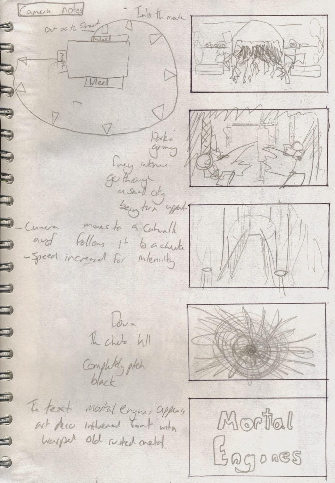
Titles 11: The Chute
After modeling the city i felt confident enough to model the gut shot of the camera going down the chute.


I used my knowledge of Keyframes in maya to make the camera go along the catwalk and down the chute. After starting to have some problems with the amount of work and rotoscoping i need to do i modeled in the handrails so that i can recolour and then render out the shot and put it straight into my intro.
Monday, 18 May 2015
Titles 10: The Model
Wednesday, 13 May 2015
Titles 9: City Plan
These are the two images I produced in order to get a better idea of what i want to model for my city pass scene, i spend a lot longer on the first image than i probably should have done, because in the end for the front i only needed a guideline rather than an entirely detailed city like in the first image. I feel like this will have brought me a little behind schedule.

I made sure i used what i got from my architectural research to help me figure out the layout and design of each of the tiers, such as the fourth being the most utilitarian and brutalist, the second being a little more art deco but still very utilitarian, then further up more art nouveau.

Titles 7: Concept art

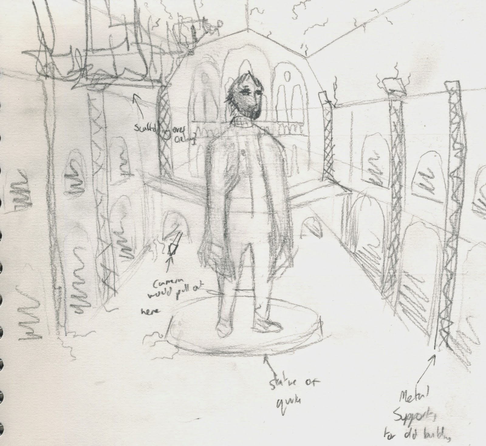
here are some concept images i have made in order to get more of an idea for a plan of the city and the front hall of the natural history museum with a statue of Quirke. I will be making a more detailed plan of london in order to model and then rotoscope.
Titles 8: Presentation and Feedback
Today i gave my presentation. It can be found here. I thought it went pretty well, i felt very confident giving the presentation and i got a lot of positive feedback and suggestions for more research, even the classmates i don't necessarily get on with very well tuned in.
Some of the stuff we discussed covered music i need to listen to and other intro such as the Charlie and the Chocolate factory intro, look up cloud atlas, bloodborne music, feel good inc, fist of the north star, wild wild west, and also look at simplifying my idea because i have taken on quite a large task. Also make sure i manage my workload effectively.
Some of the stuff we discussed covered music i need to listen to and other intro such as the Charlie and the Chocolate factory intro, look up cloud atlas, bloodborne music, feel good inc, fist of the north star, wild wild west, and also look at simplifying my idea because i have taken on quite a large task. Also make sure i manage my workload effectively.
Thursday, 19 March 2015
Visual Language 21: Colour theory
Colour theory is a theory that colours mean different things and react to each other in certain ways. Each colour has its own psychological features such as blue making the viewer feel trust, loyalty, wisdom and sadness. Furthermore colours have different temperatures and can make images feel cold or hot depending on whether its on more of a blue/green scale or red/orange scale.
It also comes into mixing colours such as additive colour mixing or subtractive colour mixing. Additive means that the main three colours are red green and blue and mix to form white, while subtractive colour mixing mixes cyan yellow and magenta to form black. Additive is mostly with computers and lights, and subtractive is paints, printers and everything else.
Colours consist of primary colours, secondary colours and tertiary colours. Primary colours are blue red and yellow, secondary are the result of mixing two primaries together, this consists of orange green and purple. tertiary is everything else. Colour wheels come into play when considering colour opposites, these are the colours that contrast most with each other. These can be found on the exact opposite of the colour wheel.
Visual Language 20: Form, Flow and Force research 3: Rayman Origins

Visual Language 19: Form, Flow and Force research 2: Prince of Egypt (Chariot Race)
Visual Language 18: Form, Flow and Force research 1: Thought of You
Visual Language 17: Form Flow and Force

For this study task we had to do some life drawing. I'm quite confident in my life drawing skills so i looked forward to it.
We started by drawing a few poses of someone as they move through a space, giving each drawing 10 seconds each. This was a lot of fun and i was left with some really interesting figures and shapes.
We then drew people expanding and contracting with 20 seconds per pose this time. Again i think this gave me some really interesting pieces.
Then we drew 15 minute poses of people pulling and pushing objects, showing a force which though i think my images are a good quality i don't think they show pulling or pushing very well.
Finally we drew a 30 minute pose which was also successful.
Visual Language 15: Take 5 Feedback
As with a lot of crits my feedback was generally quite positive however i was thankful to get some more negative feedback this time in regards to each animation.
I started with sound 6. People liked the shake effect and thought it represented the sound well, but they didn't like the top line being so static. I wanted this to represent the slight background hiss but perhaps i needed to make it move a little more to represent it.
I then showed sound 12. People generally agreed that this one felt rushed and too messy, they thought the colours were fine but my line was too all over the place, furthermore they didn't like how the "rain" was all one layer. These thoughts were similar to that of my own.
I then showed sound 18. Everyone liked this animation and there wasn't much negative criticism given, however Mike voiced that he didn't like the glow effect along the right side but i am still adamant that it was the right way to go with it.
I then showed sound 33. Everyone thought my colours where on point but felt that there wasn't enough movement to represent the sound, and looking back i have to agree, two lines doesn't feel like enough to represent the sound. Mike also said that he didn't like how my line got a lot lot looser as the animation plays, and i agree that it has a negative effect on the animation, though i intended for the line to become a lot smoother it feels more like i began being lazy as time went on rather than an intentional part.
Finally i showed sound 43. I got one comment saying that they didn't like the moving square. I ignored this comment. I also got a comment on the quality of line for my meteorite like object being a bit too rough and wishing it would be smoother and i agreed with them.
I found this crit more useful than previous ones because of the less positive feedback. I hope to have a similar experience in later crits.
I found this crit more useful than previous ones because of the less positive feedback. I hope to have a similar experience in later crits.
Visual Language 10: Take 5 Planning
I started by scribbling out some shapes and lines and generally just experimented with a few different materials while listening to the sounds, i also used my own descriptive words to try and describe the sounds.


Once i had finished i went back over my images and made some notes for the animation to be more effective.
Wednesday, 18 March 2015
Visual Language 16: Turn Around
For my turn around i did my shoe. Its extremely scruffy and i wanted to have that represented by a looser line, however the animation i feel was not hugely successful, mostly due to my own line being a little too loose for an effective animation. Though the stills arent too bad, they still feel extremely rushed and a little lazy however i don't think i will be able to get a better turn around done before submission. I will however most likely do my own turn around in my own time with a different subject.
Visual Language 8: Environmental Storytelling 3: The Grand Budapest Hotel

Wes mostly takes influence from old cinema for his social interactions in his films such as positioning of the actors and line delivery, furthermore the special effects of this film is supposed to emulate 50 year old filming and special effects techniques such as models and panted backdrops. This shows how despite no high end effects being used a successful film can still be created.
Colour is used a lot in the costume designs of characters, the antagonists of the film all wear black or otherwise very dark clothes whereas the neutral characters and protagonists all wear very bring clothing.
Visual Language 1: My Sketchbooks

After working on a range of sketchbook sizes this is what i thought about each size. I mostly prefered working in the large square sketchbook and the A4 sketchbook however i did enjoy working in the long rectangular one and the smallest square one.
Tuesday, 17 March 2015
Visual Language 14: Take 5 Research 3: Mr Scruff
These animations are designed to be simple so that it doesnt distract from the music itself yet still provides some visual entertainment. Furthermore Mr Scruff is a lighthearted man and his animations reflect this, they don't make any complex movements and they don't ease in and out but they give indications for when certain musical keys come in.
Visual Language 13: Take 5 Research 2: Fresh Guacamole By Pes
Without these sounds i feel the animation would be a lot less successful, since the sounds makes the slicing of objects satisfying.
Visual Language 12: Take 5 Research 1: Bit.Trip Runner

Visual Language 11: Take 5
For the take 5 brief i chose my 5 sounds. I chose sounds; 6, 12, 18, 33 and 43
I started by animating sound 18.
I animated this in after effects using some layers of lines i created in photoshop. I wanted to keep it quite mechanical looking but because i could hear the levels changing in the audio i wanted to change the levels of the lines in order to represent each layer of audio i heard. I also added some glow effects to further give the electronic mechanical feeling i wanted. Overall i am quite proud of this sound.
The next sound i animated with sound 33.
For this animation i used a hybrid of photoshop animation for the circle movement and keyframes in after effects for the square. I regret my choice of background colour, though i did mean it to be quite drab i didnt want it to be as intense as the colour is on the final animation, furthermore i wish the curves of the circle movement were smoother so i will most probably go back and re do my line work, however i feel the sounds get represented in this animation.
I started by animating sound 18.
The next sound i animated with sound 33.
For this one i animated in photoshop as i thought the sound was a lot more natural so i wanted to keep my natural line in there. I picked out the colours because i thought they represented each sound the best and i wanted to keep a white background because of how little ambient background sound there was. After getting some feedback from Mike i realise that my line slowly loses the quality it started with which wasn't part of my plan and i don't think it adds anything to it so i will go back and change this at some point.
Next i animated sound 12.
i feel this was my least successful animation, this is because i rushed it and didn't put in as much effort to experiment with more than just a handful of layers. The thump noises at the beginning was how i imagined the sound but i felt the rain like sound after this was more layered and random however due to the fact i only used one layer it feels extremely two dimensional and not as dynamic as i wanted it.
After this i animated sound 6.
For this animation i am quite conflicted. The final animation was exactly how i had planned it out, however it feels extremely plain. I am unsure if i didn't animate the sound correctly or i just perceived it as a plain sound however the movement in the animation is exactly how i wanted to as the shapes shake as the sound buzzes when it hits a certain frequency but otherwise feels extremely plain.
And finally i animated sound 43.
Visual Language 9: Set, Series and Sequence Feedback
The feedback i got from the group for my images i showed for the set series and sequence brief were all very positive, they liked how much i experimented with different media and how much of a range of subjects i had used for my images. I would have liked some more negative feedback though as i feel this is what really improves work, the only negative feedback i got was about not having the last 12 images done on time which was quite annoying despite how much of an ego boost the feedback gave me.
No work is perfect and next time i'd like to see some more feedback on improvements i could make.
No work is perfect and next time i'd like to see some more feedback on improvements i could make.
Visual Language 7: Environmental Storytelling 2: Dark Souls
Dark souls is a difficult game. It is a game where every move you make matters, and if you make a mistake, you die. So naturally, in a game where you need to weigh up your odds before taking on a certain environment you want as much information as possible. Dark Souls is fantastic at environmental storytelling, from the burn marks on the ground and charred corpses to hint at immanent danger to the corpses at the bottom of long drops to hint you might not come out alive of this one, dark souls is constantly giving you hints to the dangers. Not only this but there is an item in game that lets you write notes to come up in other players worlds for you to give them hints to treasure or perhaps bring their downfall.
Not only is the environmental storytelling fantastic at warning the player of danger, its also fantastic at giving us the lore. Like most successful storytelling techniques, none of the lore is completely out in the open, a lot of it is up for the player to decide their own theories on how certain events took place, how certain items get to certain places. A lot of difficult terrain in the land is a result of the fact that it was once ruled by giants, so a lot of the difficulties you have getting around the land is because you are a normal sized man in a giants world. This add more difficulty to the game but not in a bad way.
Since i have played dark souls i have followed a youtube channel called ENB or EpicNameBro (Link here) of whom plays through the game but also speculates every tiny bit of lore he comes across and would highly recommend watching to get more information on the vast lore of Dark Souls.
Wednesday, 11 March 2015
Visual Language 6: Environmental Storytelling 1: Limbo


In this image we can see a segment of the game where almost all vision of your surroundings is taken away. This part of the game makes you naturally uncomfortable because the telltale signs of danger have been taken away, making this segment a particularly tough one.
Monday, 9 March 2015
Titles 6: Storyboard

This is the storyboard i have developed for my animated intro. I think it shows the setting of london and at the same time inspires adventure and curiosity that i'd like this title sequence to convey.
Titles 5: Architectural Consideration

Titles 4: Moodboard
After getting some notes for things i wanted to look up, i looked them up. I found a range of concept art and some film screenshots and picked out the elements i liked.

I then looked at fallout for its use of both oldschool buildings held up with new technologies and materials for the natural history museum and St Pauls Cathedral, and also its use of the vault system, for its orderly yet oddly dingy and gross feel for the lower working levels of London.
Afterwards i looked at howls moving castle for the fact its a large moving structure however i fould its design and animation too cartoony, and i want my design to feel quite dark.
Finally i looked at Oblivion for its design of the wastelands. I liked oblivions designs because of its almost completely untouched look, with only hints of an old civilisation with ruins, a barren yet alive landscape. This is something i would like to carry over to my animation.
I am going to look more into the architectural styles for each of these individual references to understand the shapes of buildings.
Sunday, 1 March 2015
Titles 3: spitballin'
For the first work i have done for this project i have created two pages where i do a mixture of taking notes from the book, doodling ideas and potential sources for reference images and video. This can be seen below.
 I started with some general ideas, the first page i noted down key features of the book and some doodles of key features too.

On the other page i made notes firstly on how the first few chapters of the book go in order to get an idea for what to focus on in the intro and keywords and phrases for specific areas of the book. I then looked up some films and techniques for concept art.
Wednesday, 18 February 2015
Visual Language 5: Water and CoffeeShops

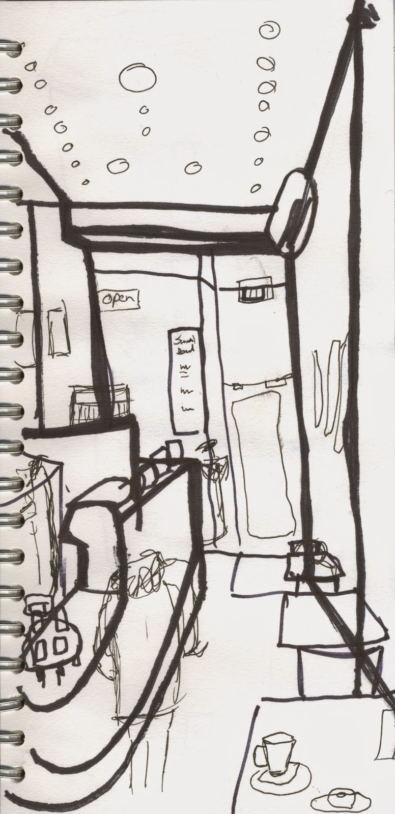


Theres are the images i produced for our environmental storytelling. The three locations i chose were coffee shops, canals and Oscars Flat. I chose these locations because i thought i could produce some interesting images from them, i am particularly proud of my coffee shop images. I eventually gave in to my vice of doodling a little in some of my images but since i was still in the locations at the time i feel it still had an influence of the doodles i produced. I also tried out a bunch of different sketchbook sizes ranging from a large square one the size of an A4 sketchbook but square, a tiny square sketchbook that easily fits into pockets and a long rectangular one that was the length of an A4 sketchbook but the width of an A5. It was fun to try out each one and i prefered the larger square sketchbook until i realised it wouldnt fit into the average sized scanner. As of this moment i am unsure which i prefer but i feel i know what to expect from these shaped sketchbooks in the future.
Subscribe to:
Comments (Atom)