Showing posts with label StudioBrief2. Show all posts
Showing posts with label StudioBrief2. Show all posts
Thursday, 21 May 2015
Titles Research 2: Wild Wild West
I watched Wild Wild West to see how they went about making a down graded giant robot spider and other intense mechanical creations that are ahead of that time. Also to see how they went about making giant mechanical structures seem so large. The way they framed the spider, such as using low camera angles to make the giant mechanical spider seem bigger. Though the focus was more on Will Smiths character the mechanical sequences were all very well done, and the designs for western clockwork and gritty machinery where quite cool, but a little goofy.
Titles 16: Philip Reeve's Feedback

Titles 15: The Final Intro
Titles 14: The First Draft
Titles 13: Title

Titles 12: Re-Evaluating and Wire Framing
After burning out and having other problems at this point in the project, i realise i have taken on too much for myself once again, similarly to every other project i have done so far this year. This meant that i had to re-evaluate what i wanted to produce as an intro for Mortal Engines, and how i could make it easier for myself.
The first part was to scrap rotoscoping London. Instead i stylised the segment to look like it was being seen through Shrikes eyes, a character that is augmented with high tech machinery, therefore i decided to render out the london shot only as vectors in order to give the feeling of early video games such as Asteroids or lunar Lander. Below is the image of the result, i am very happy with it.

I also decided to scrap the shot of Tom opening his eyes, and only go from the doorway of the natural history museum down the street, and have the credits roll here. I have yet to decide if i still want to rotoscope this segment or not, but time is running out so i am definitely leaning towards a different method at this point. I am considering making assets in photoshop and making a 3D street in after effects.
Titles Research 1: Feel Good Inc
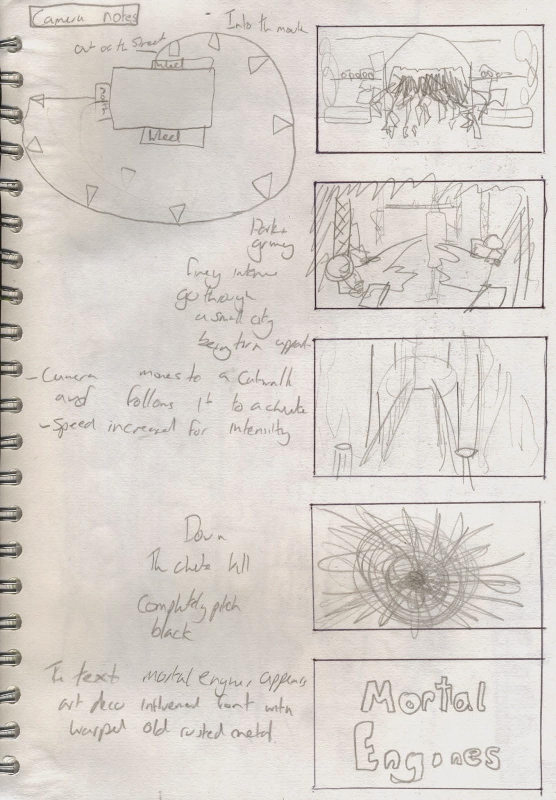
Titles 11: The Chute
After modeling the city i felt confident enough to model the gut shot of the camera going down the chute.


I used my knowledge of Keyframes in maya to make the camera go along the catwalk and down the chute. After starting to have some problems with the amount of work and rotoscoping i need to do i modeled in the handrails so that i can recolour and then render out the shot and put it straight into my intro.
Monday, 18 May 2015
Titles 10: The Model
Wednesday, 13 May 2015
Titles 9: City Plan
These are the two images I produced in order to get a better idea of what i want to model for my city pass scene, i spend a lot longer on the first image than i probably should have done, because in the end for the front i only needed a guideline rather than an entirely detailed city like in the first image. I feel like this will have brought me a little behind schedule.

I made sure i used what i got from my architectural research to help me figure out the layout and design of each of the tiers, such as the fourth being the most utilitarian and brutalist, the second being a little more art deco but still very utilitarian, then further up more art nouveau.

Titles 7: Concept art

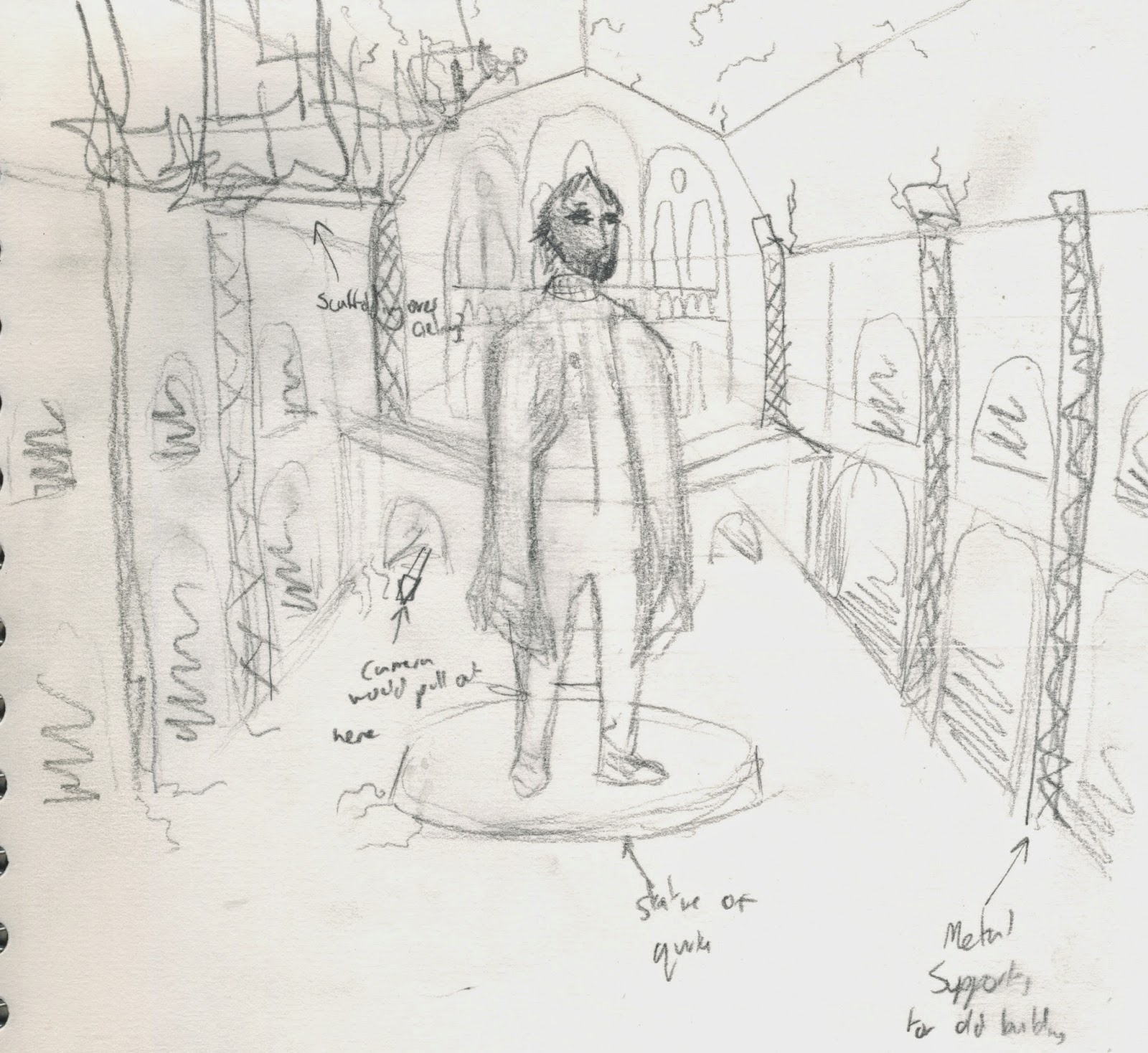
here are some concept images i have made in order to get more of an idea for a plan of the city and the front hall of the natural history museum with a statue of Quirke. I will be making a more detailed plan of london in order to model and then rotoscope.
Titles 8: Presentation and Feedback
Today i gave my presentation. It can be found here. I thought it went pretty well, i felt very confident giving the presentation and i got a lot of positive feedback and suggestions for more research, even the classmates i don't necessarily get on with very well tuned in.
Some of the stuff we discussed covered music i need to listen to and other intro such as the Charlie and the Chocolate factory intro, look up cloud atlas, bloodborne music, feel good inc, fist of the north star, wild wild west, and also look at simplifying my idea because i have taken on quite a large task. Also make sure i manage my workload effectively.
Some of the stuff we discussed covered music i need to listen to and other intro such as the Charlie and the Chocolate factory intro, look up cloud atlas, bloodborne music, feel good inc, fist of the north star, wild wild west, and also look at simplifying my idea because i have taken on quite a large task. Also make sure i manage my workload effectively.
Monday, 9 March 2015
Titles 6: Storyboard

This is the storyboard i have developed for my animated intro. I think it shows the setting of london and at the same time inspires adventure and curiosity that i'd like this title sequence to convey.
Titles 5: Architectural Consideration

Titles 4: Moodboard
After getting some notes for things i wanted to look up, i looked them up. I found a range of concept art and some film screenshots and picked out the elements i liked.

I then looked at fallout for its use of both oldschool buildings held up with new technologies and materials for the natural history museum and St Pauls Cathedral, and also its use of the vault system, for its orderly yet oddly dingy and gross feel for the lower working levels of London.
Afterwards i looked at howls moving castle for the fact its a large moving structure however i fould its design and animation too cartoony, and i want my design to feel quite dark.
Finally i looked at Oblivion for its design of the wastelands. I liked oblivions designs because of its almost completely untouched look, with only hints of an old civilisation with ruins, a barren yet alive landscape. This is something i would like to carry over to my animation.
I am going to look more into the architectural styles for each of these individual references to understand the shapes of buildings.
Sunday, 1 March 2015
Titles 3: spitballin'
For the first work i have done for this project i have created two pages where i do a mixture of taking notes from the book, doodling ideas and potential sources for reference images and video. This can be seen below.
 I started with some general ideas, the first page i noted down key features of the book and some doodles of key features too.

On the other page i made notes firstly on how the first few chapters of the book go in order to get an idea for what to focus on in the intro and keywords and phrases for specific areas of the book. I then looked up some films and techniques for concept art.
Tuesday, 10 February 2015
Titles 2: Which Book?
 For this brief i decided to use one of my favorite books, Mortal Engines by Philip Reeve. i chose this book because it has a nice flushed out world but at the same time is very open to interpretation in regards to the designs of certain places and objects. Furthermore its one of my favorite books so rereading it won't be a problem. At the same time i feel that my love of the book with improve the quality of my animation.
Monday, 9 February 2015
Titles 1: Why Titles?
For this module we had the option to pick a brief from 3 options. The Options were;
Brief 1: idents - Pick two TV channels to do a 20 second animated ident for each. We could choose from; E4, Cbeebies, BBC 4 and Discovery Channel to do idents for.
Brief 2: Title - Pick a book that doesn't already have a film adaption to do a 30 second animated title sequence.
Brief 3: Campaign - Choose from either Amnesty International or Childline to develop a 30 second animation to raise public awareness for each charity.
I chose Brief 2 out of the three because i feel like i will be doing a lot more brief like 1 and 3 in my earlier career as an animator and felt i could use the opportunity to do something i think i would find really fun. Furthermore Brief 3 sounded especially dull and depressing as there is already a surefire way to create effective charity animations and i wanted to experiment a bit more.
Subscribe to:
Posts (Atom)