In order to get some more ideas on how lava and crystals move in real life i created a playlist of references that can be found here. Crystals grow a lot smoother than i thought they would which may be problematic when it comes to animating it moving whereas seeing how lava moves makes me feel more confident about animating it since there is such a wide variety of ways it can move and it'd be simple just to make it run off a skeleton.
My next plan is for me to film myself walking in different ways in order to decide how the golem will hold himself as he moves.
Friday, 26 December 2014
Wednesday, 26 November 2014
The Classical Elements 3: Idea Development- The Golem
Since he's the main character i wanted to focus on the design for the golem I started out by working out what kind of animation i wanted it to be, a serious badass golem on a quest or a cheesy Mr Ben style walk down a street. I did this in the image below. I also looked up some history of the term golem in case it gives me any other ideas.

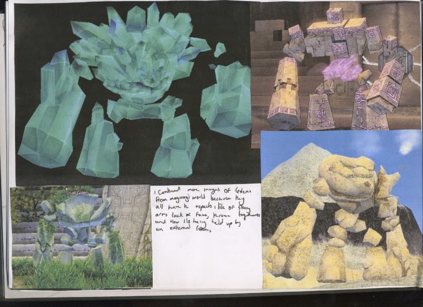
After i determined how serious i wanted to the animation to be i started looking up different styles and references i would like for the design of my golem. The notes i made can be seen in the images below. I used multiple references however i did mostly keep it to videogame golems.


after i got some references and picked out what i like i began to play with a few ideas for designs of my golem. I mainly focused on the first design for my golem as the other two stages would be built up around the original design. As of right now i don't really like any of my designs but i plan to do more drawings to work on that.


I also played with an idea for the final goal of the golem and i did this in a collage/pencil mix, maybe i could do an animation with cut outs similar to Terry Gilliam.
Friday, 14 November 2014
The Classical Elements 2: Idea Development Refinement

Visual Language 0: Set, Series and Sequence Initial Idea Development
For the first part of the Set, Series and Sequence brief we have to select a key work from a list and develop 32 images from it. I have selected Science because i thought it would give me the most artistic freedom and variation for what images i could create. Before i started drawing any images i developed a spider diagram in order to get down everything that could be associated with Science. This can be seen below.

Tuesday, 11 November 2014
The Classical Elements 1: Idea development
For our first studio brief; The Classical Elements, we have to develop a 20 second animation at 12 fps about one of the four elements; earth, water, wind or fire. so in order to determine which element i wanted to focus on (because using them all would be too much work) i decided to do a spider diagram.

In the end i determined that i would focus on a character made of rock going on a journey to work and encountering other elements along the way and them in turn effecting him in different ways. I decided on rock because i thought as an element it isnt used much in the media, you have a lot of water and fire creatures but not many for wind and earth and i think the different states earth can be found in is very dynamic and would be a lot of fun to animate.
Monday, 10 November 2014
Story Boarding Research 5: Adventure time
For my last storyboard research i wanted to do it on adventure time since its more of a childrens TV show rather than a feature length production.


The fact its only two keyframes per page means its easy to show movement but also scenes can be moved around easily. A good compromise. Unlike other storyboard notes what the characters say is noted down and the movements are shown through image. I was surprised to see that there is no colour, but at the same time the colours of the characters are so well known its unnecessary
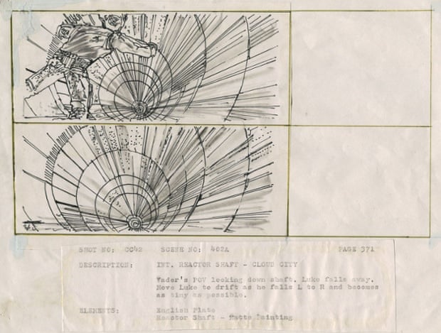
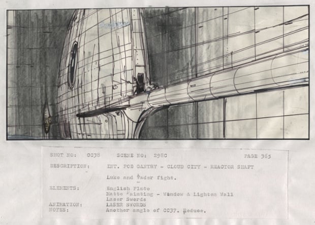
Story Boarding Research 4: Starwars
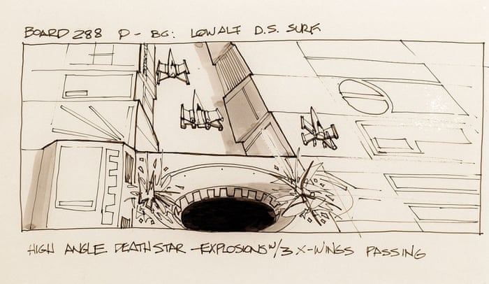
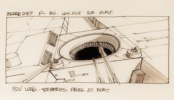
For more storyboard research i wanted to have a look at something that was more FX based rather than a full on animated film, i also wanted to look at some older storyboards so i thought the two could come together in Star Wars.
The drawn pictures are a lot less sketchy than what i have seen, it almost reminds me of a graphic novel, furthermore its developed at the same time as the concept art so some of the frames are both concept art and filming directions. I also noticed that there are less information about movement of characters and objects and more about the type of shot or camera movement. Its a lot cleaner than the storyboards i create but i think thats something i need to develop as an artist anyway.
Mr Scruff Wobble Control
David O'Reilly
Last night i went over to Gavin's house, a classmate, with another friend. I really enjoy going to Gavs because he always has some new interesting animation to show us. Today he showed me a really interesting animation. it was called, The External World, created by David O'Reilly who also worked on an episode of Adventure Time named A Glitch is a Glitch.
There is quite a low polygon count and the movement of non mechanical objects are quite low FPS. The whole show consists of small sketches of different things that are supposed to be happening in the city with themes of shock value, contrast and the taking of things literally, the show almost feels like an experiment of social composition taking situations and twisting them, a common theme in O'Reilly animations. Its target audience is most likely teens to young adults, it comes across as quite experimental, but i for one really enjoyed its shock value and we all has a couple of laughs at different bits.
Moses
Marcel the Shell with Shoes on
The TV show
The Rabbit and the Crocodile
The Rabbit and the Crocodile is an animation i made for the last brief of this module that examines a number of key words. The key word i chose was love. At the start i had a lot of very complex ideas all about emotions and peoples minds and i really struggled to get a simple enough idea that would be suitable enough for a 10 second animation. In the end i got to the idea of a rabbit that falls in love with a crocodile and after traveling a great distance and with a lot of difficulty he finally gets to his love only to be eaten by him.
In order to get an idea on the timing of my animation i created this animatic from my storyboard. I then worked out how many frames it would take at 12fps to last as long as it does in this animatic.

After a long while of drawing out each frame i finally had it done. I had made a few shortcuts, for example on one scene where the rabbit is looking at the road he has to take it is 24 frames long but instead of drawing the same thing 24 times i just drew it 6 times and repeated it so that it still has the slight shake that you get from hand drawing an entire scene for each frame but it didnt have to take as long.
I think next time i create a hand drawn animation i am going to have maybe two or three frames for the background so it has that slight shake but also have the characters animated separately and overlay them and see if that takes as long.
Daddy Kill The Spider
Having done hand drawn animation myself i find myself really appreciating the amount of work that will have gone into making this video. It doesn't stop me from being a little bit creeped out from it though.
This style of work has become quite popular and i talk about another short film in a similar style to this here
Don't hug me I'm Scared
Don't hug me I'm scared is another short video that portrays itself similar to an educational video for children but has an element of creepiness that caters it more to adults. I talk about an animation here which has a similar style of portraying itself like an educational video but ends up being creepy.
We will start of with DHMIS 1 which is all about creativity. This one starts off tamely and really does feel like a kids TV show. There is a few elements of bluntness which almost feels like a representation of the bluntness of life, but after a small segment where everything goes digital rather than puppets everything gets really dark with images of hearts and organs and death. The shock of this sudden transition is what freaks people out and that freaking of people out is what draws them back to it.
With the second animation the directors realised that the shock value of the first will need to be topped and from the very beginning it keeps its bluntness and its shock value and only adds upon it. I think this part of DHMIS is my favorite.
For the final part i feel they dropped the ball. I feel they swapped obvious bluntness and shock images for a more psychological feeling and i think the quality falls because of this. No doubt it is still entertaining but i really think the second one is better. I do like the cultish nature they introduce nearer the end but i would have prefered a bit more of a build up rather than a sudden plot switch.
Bob Ross' Layers
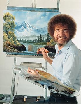
Another link i made was how similar his paintings look to the traditional backgrounds of old animation films, they have a similar slightly blurred out feel and the use of brush strokes to give the impression of objects. For example the below images are a background for a scene in The Fox and the Hound and a painting by Bob Ross.


Though Bob Ross' style can easily be seen, the similarities between the two images are great, particularly the clouds and distant parts of the images which are both very blurred and there is a lack of bold outlines or much of an outline at all, which contrasts with the outlines of the animated characters.
The Adventures of Tintin
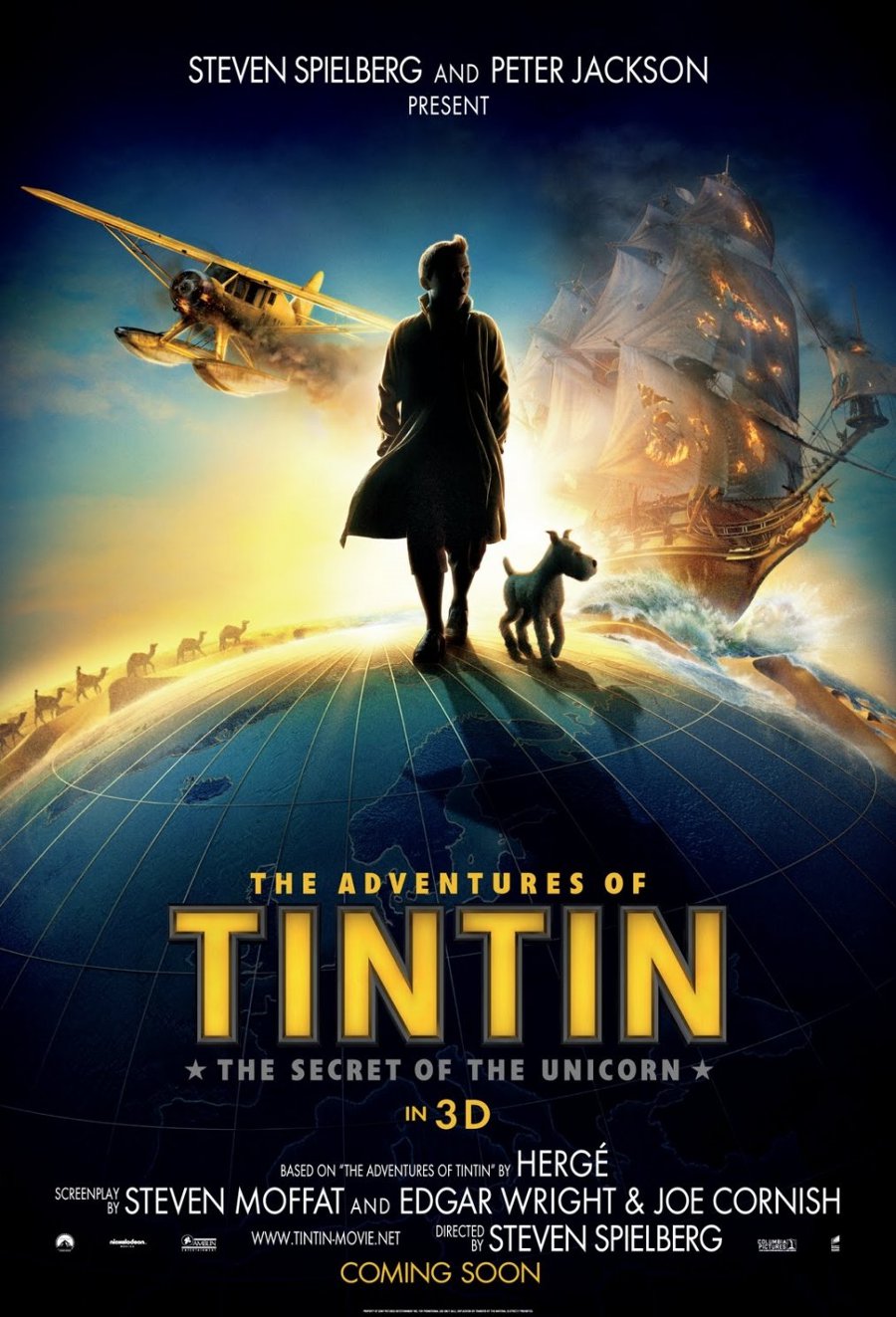
The uncanny valley is a theory behind why we feel so uncomfortable with things that take human form but aren't human. Films such as The Polar Express show a lack of understanding behind the uncanny valley, the characters are a human shape and move very similar to humans but the eyes have a lack of humanity about them which adds an element of creepiness.
The Adventures of Tintin however shows an understanding of the uncanny valley; though the characters move very close to humans the facial shapes are exaggerated, overly large noses, overly small eyes etc, furthermore the action scenes have a slapstick loony-tunes feel to them with a lot of variables reacting in such a way that the characters are unrealistically lucky, a trope that is fun at first but soon gets tiresome.
Overall i found the story to be relatively average, a boy goes on an adventure and finds treasure, defeats the bad guy etc, but the understand for the uncanny valley and the characters movement really draw me into this film, and i am definitely looking forward to The Adventures of Tintin 2.
Pose to Pose 2: The Fall

For my second pose to pose i wanted to do a slapstick-esc fall but i was not comfortable in my abilities enough to do it anything other than a small ball. The final animation wasn't terrible, but the amount the ball slows in and out, particularly at the top of the arcs where it slows down quite jarringly is something i wish i had foreseen in my plans. Other than that i actually think this animation was quite successful, i quite like the small amount of jiggle the walls of cliffs have from drawing them out over and over again, it is very similar to that of older animations like Roobarb and Custard.

Sunday, 9 November 2014
The Reward
But in all seriousness i do really love this animation and i feel it has altered my philosophy as a person. The animation is about two strangers becoming friends as they go on a epic adventure in the promise of treasure. Though they have a rocky start they become proper bros and in the end when they finally reach their destination, they realise that the treasure was no physical object, it was in-fact the journey itself and how it helped them grow as people. This idea of growing as a person through travel is something i plan to do after university.
Two key parts of this animation apart from the story that i want to talk about is the FPS and the world design.
The movement of people seems to have quite a slow framerate, if i had to guess i would put it around 12 or maybe even lower. The fact that its low is not what interests me, its the fact that its still effective at conveying movement and emotions of the characters despite seeming relatively "choppy".
The world design is great. It has everything i love in regards to art pieces; vivid colours with great contrast, imaginative fantasy design and an overall light hearted feel similar to that of Adventure Time or gravity falls. I particularly love the design of the vertical city, it reminds me of the descriptions of the cities in the Mortal Engines Quartet.
I'D GIVE THIS ANIMATION A 235432/10
How are photography
Today we were taught how to effectively use a DSLR, i've done this before so i know how to use the depth of field, aperture, exposure and iso so i will keep this quick as i can.
The aperture (or F stop) effects the amount of light let in and it also effects the depth of field. By changing the aperture you can get a number of effects.
In this image we can see a large amount of distance is in focus, this is because of the aperture being small, in this particular image it was F22.


Whereas in this image there is a large aperture, this leaves us with only a very small distance in focus. This leaves us with a very clear indication where the main focus of the image is. This image was taken at F 4.5 but i love taking photographs with wider apertures.
Next up is the shutter speed, shutter speed also affects how much light enters the sensor however the main difference is it affects how much blurring there is. In this first photo i had a very fast shutter speed in order to catch Lewis in mid air and freeze him there.
Whereas a slow shutter speed lets more light in as things move and you often get some fun effects for example it can capture the light trails of cars and if moved correctly you can make one part of the image. In this image i used a slow shutter speed in order to catch Lewis moving down the corridor and it looks pretty damn swag.
The ISO is also a key part of a DSLR, the ISO affects how much light is digitally added in the camera itself. The higher the ISO the lighter the image will be without a flash or altering the shutter speed and aperture but it will also make the image grainier.
Friday, 7 November 2014
Pixelation Act 1: Introduction and Planning 20/10/14
Today we were given our next brief which was to create a pixilation with a particular theme. The theme i chose was Host and Parasite and i began planning a storyboard (Shown Below) of how i wanted the story to go. In the end i decided on some kind of object taking over our main character and making him fall down the stairs. I am also going to make his movement very smooth as that kind of effect is quite cool in pixelations and i want to give it a go.
In Between
The animation itself has a lighthearted feeling (despite being a potentially difficult subject depending on how deeply you read into it), which i believe is from the light pastel colours and how smooth the movement of the characters feel. The crocodile itself is animated enough to feel like a nuisance, whereas the people move more meaningfully with the occasional mannerism thrown in. This is clear in the first scene in the psychiatrists office where the only movement is the lips of the character and his hand tapping a pen.
Overall i find the animation to be well executed if a little same-y since it has a feeling of traditional 2D disney animation, however i feel the subject of the animation is well addressed and put under a creative light in order to keep it lighthearted. This will be an animation that will stick with me into my adult life.
Pose to Pose 1: The pendulum
Today we tried proper pose to pose animation. Pose to pose animation is different from Straight ahead animation because it is all planned out before it is drawn.

A few of my class mates had different techniques for working out how to space their pendulums but i decided to start with a key frame at the top of each side and one in the very middle. I then halved the space exponentially moving higher up each time.
Another problem i faced was that there was one two many frames on one side of pendulum and not the other. I fixed this by moving my plan around and did the same again on the pendulums way back. In the end i think it was quite successful, and i will most likely use a different technique in my next pose to pose animation.
Thursday, 6 November 2014
Nyan~ Neko Sugar Girls; The Worst Animation EVER
Last night at Gavs house we watched probably one of the worst animes i've seen ever and i was desperate to talk about it on my blog so what i thought i'd do is run through why this animation is such a travesty with the knowledge i have so far as an animator.
The first thing that we're hit with is an intro song which seems too good for the quality of the rest of it, according to Gav it is a song from a Japanese fighting videogame however i couldn't back this statement up with any evidence. Once the intro is over we hear the voice acting which is riddled with peaking puffing and popping, most likely due to a low quality microphone, furthermore the volume levels of each of the characters are extremely different which can be extremely jarring during a dialogue between two characters. The language of the characters is beyond belief, all of the characters' speech is spoken with some kind of fake accent that doesn't seem to similar to any real life accent, though the badly pronounced occasional Japanese word hints that it may be an attempt at a Japanese accent. The final outro seems to be a mix of all of the issues i have already listed with some badly played musical instruments thrown in too.
The animated quality consists of only key frames with a slightly altered duplicate to attempt to give a sense of realism to the characters as no real person is completely still, however there is nothing else, with some shots consisting of only one frame at a time, i would talk about how the creators uses the 12 principles however it seems that they've all been ignored for the most part.
The art of Nyan~ Neko Sugar Girls is extremely terrible, all of the characters faces and bodies are extremely badly proportioned with the volume of different parts of the characters seeming to change from shot to shot. The bodies of the characters mostly consist of rectangles, with two large balloon like objects for breasts on one of the characters. All of the drawing and colouring seems to have been done in MS Paint with very clear issues that happen with working with MS paint, like some pixels not being properly coloured because the colour is only a few points away from being pure white, and a very difficult to work with colour pallet. There is no shading apart from a large dark shadow under the breasts of the girls which seems not to follow traditional lighting rules, hinting at the possibility of this anime existing in a dimension where the laws of physics are not the same as our own.
The story line is very difficult to follow, mostly because the voice acting quality is so terrible, but after looking up the plot on google it seems i didn't really miss much. The plot consists of two cat girls named Raku-Chan and Koneko-Chan who hang out with a guy named Hitoshi-San. Hitoshi gets kidnapped by a man who plans to rape him (Hitoshi later begins to have feelings for his kidnapper which makes me feel uncomfortable as it trivialises rape). He gets saved by the girls but Then Raku gets bitten by a squirrel, and everyone thinks she gets rabies, but actually a "neko demon" is inserted into her body.
Overall this anime is a mess, but it's a lot of fun to watch when drunk and is a very good pick me up when we are beating ourselves up about our own work. At least we will never create something as bad as Nyan~ Neko Sugar Girls.
Wednesday, 5 November 2014
Story Boarding Research 3: Spirited Away

Story Boarding Research 2: Let me tell you about my boat
Another area of storyboarding i wanted to explore was the difference between animation storyboarding and film storyboarding, so naturally i turned to Wes Anderson as a lot of my favourite films are by him. While looking through a book on Anderson i found an interesting storyboard for a sequence in The Life Aquatic where he takes us through a boat showing us all the different rooms.

With this story board as we can see there is a lot less drawing and a lot more note taking, furthermore the drawings are tiny and simple with no colour at all. However there is a lot more information on the technical aspects of making the shot work. This storyboard is simple and understandable without someone presenting it to you, however the lack of more key frames makes it harder to understand at the same time. These notes are obviously for Wes himself for example where it says "Do some sort of move to ogata's cake and life aquatic companion series" which to someone who does not know the film will have no idea, however these are key movements and phrases that help keep the director in the right space at the right time.
The more i look at this plan the more i think it may no be a story board because of how little drawing there is and because the film is not animated in the particular sequence, however i wanted to talk about it, particularly as it contrasts so much to the way pixar storyboarding works.
Pixelation Act 2: Shooting and Editing
After storyboarding and planning my pixelation it was time for shooting, i decided to shoot it all in college as it provided me with a nice enough space for all my shots such as hallways and stairwells. A few issues i faced while shooting this included an actor not working quite the way i wanted him to as he was expecting the pixelation to be continuously shot whereas i wanted him to move from pose to pose. I was unable to fix this issue. However i also faced an issue mid way through shooting where i completely underestimated how many shots i would need to make the pixelation run smoothly and slow enough to tell the story. Annabeth brought this to my attention mid way through shooting scenes, meaning i had to go back and re shoot them. This wasnt that much of an issue however because i am quite pleased with the finished animation.
Editing was super difficult, this was mostly due to me not realising there were resources available on estudio however i still feel that adobe premiere is going to take a lot of practice to get used to.
Overall i'm quite proud of my Pixelation, the flickering from the lights is quite irritating but i was unsure of how to fix this without missing my deadline. But apart from that i feel my pixelation has been successful.
Story Boarding Research 1: Pixar
With storyboarding there is a general layout on how they are set up, it has to be clear and it needs to tell the story the creator wants to portray accurately and clearly, however in the professional industry each technique varies from creator to creator. Over the next 5 blog posts i will explore a few of my favourite animators/animation studios and the way they go about storyboarding.
First on the menu is pixar, and i found that they do their storyboarding a little different to the way we were shown in class. The first thing that caught my eye was just how expansive their storyboards are, they are put up on huge boards and the boards are arranged into scenes, i knew that often storyboarding was a huge amount of work but i had no idea it was this expansive.

The second thing that i noticed was different was that each key frame didn't have any notes, so when the storyboard artist is running through it with his colleagues he explains the movement and often voices the characters themselves it also is quite an informal discussion as often the storyboard artist gets suggestions mid way through his presentation and often ties them in to the presentation.

The last thing i noticed was that the images used for the storyboards are often quite refined and with character designs and animation tests already under the animation teams belt, this hints that the story was already largely planned out before the storyboard was made which means that the storyboard may just be the formal solid plan for the story before it all goes ahead, rather than being the plan at the beginning it is more of the midpoint.
Tuesday, 4 November 2014
Flip-booking Act 2: Blood and Photoshop

With this flipbook we needed to explore arcs so i decided to keep the bouncing ball but i made it bounce on the floor and then the wall to practice with spacing, squash and stretch, easing and arcs.
I was quite proud of the outcome so i decided to add more shapes to it in order to practice with some secondary actions with the ears and tail and again i think this turned out quite nice as the ears bounce realistically. The tail could probably have used with a little more work as it would likely bounce more than it does.
On friday we then also got taught how to make gifs in photoshop, so i scanned in the pages and made this animation. I then also played a little bit with a graphics tablet and added the blood effects.
Overall i think this was quite a successful beginners animation, obviously it needs some work but i feel that it shows an understanding of a good amount of the 12 principles.
Flip-Booking Act 1: SORT OUT YER VOLUMES

Friday, 31 October 2014
Illustrator: The Pen Tool

Later in the session we experimented with different line effects, this was fun but it also felt extremely gimmicky rather than serious tool for creating logo purposes.
Thursday, 16 October 2014
Story Boarding Act 3: Peer Review 13/10/14
So today, before we started on our next project (for which i have made another blog post), we had a quick peer review for everyones refined storyboards, i set myself a goal of leaving at least one constructive comment that was a little more negative and a positive comment for each storyboard as i found that as much as i enjoyed the praise i got for my first draught i wish i had more comments pointing out flaws in order to improve on next time, and you know how the saying goes; treat people how you want to be treat.
These are the comments left on my storyboard;

The mix between people liking my sketchiness and not is something that i can deal with, not everyone likes that particular style, but when people say its clear but then other comments say it isn't i feel it is a little jarring, furthermore i have no understanding what the comment saying "either use more colour or none at all" means or why the writer thought that'd be an effective way of improvement... maybe it'd be worth doing a peer review where i present it to the class and ask for comments in order to stimulate a discussion, for example how it isn't clear and how personally they would improve it etc etc, perhaps in the future i will organise a peer review for myself in this way.
These are the comments left on my storyboard;
Wednesday, 8 October 2014
Story Boarding Act 2: Refine, Sneeze, Refine, Sneeze 7/10/14
I am rather full of cold today, nevertheless i think that the extra work and comments on my storyboard has gone a long way in improving it, despite having my eyes closed mid sneeze for half the day... In order to make some improvements i decided to bring in my laptop in order to get some reference images to clear up some sketches in order to use writing less, like one of my peer comments said. I also picked up three coloured pencils in order to show different effects. I chose Red for movement, Blue for sound, And yellow for lighting which i realised was a mistake when i found it so hard to read back the lighting directions i wrote for myself, it did give some idea of lighting in the images themselves but as a note to myself; don't try and write in yellow again... EVER!

The story itself didn't change very much, it was still the same basic story as before, i didn't change the shots around that much either up until the shooting scene either, i did however refine my drawings so that they were clearer and added the other instructions with colours visually using arrows and lines and evidence of areas i also made sure there was less unnecessary writing so instead of a constant cutting back and forth for lines it has a simple "drug transaction" written in for the two key shots i want to use of the two characters, jack and the mafia boss. Here are my finished sheets:
The deadline for completing these storyboard is this sunday and next monday is when we will have another peer review for our more refined storyboards.
Story Boarding Act 1: The Brutal Twist 6/10/14
For the first part of our course we were given an introduction to storyboarding. Mike Showed us a few examples of ways animators and film makers storyboard. We saw how storyboards develop from rough sketches on sticky notes to more anatomically refined drawings clearly giving instructions on how characters and props should move and where shots should start and end.
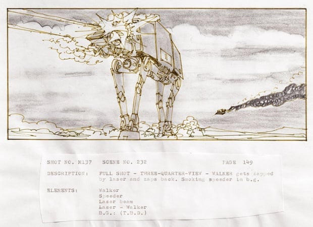
The thing that fascinated me the most were the images of the thumbnails all stuck up chronologically on walls, theres something about the mid point between an idea in your head and a full (potentially feature length) production that has always fascinated me, i remember from an early age being forced to watch a making of documentary of the original StarWars trilogy, seeing the film in its rough planned out on boards and loving the idea of the film being practically already made and being put up on walls like some kind of bizarre gallery... at that moment i was more concerned about the cool action scenes, but i definitely developed more of an appreciation for story boarding as i grew as an artist and developed more wacky stories in my head that simply writing didn't feel like enough, but i digress...
As a task, Mike asked us to think of a nursery rhyme and develop a story board with it. Despite having a terrible memory for nursery rhymes i managed to pull a mangled mess from the deep dark hole of my brain known as my childhood and identified it as Jack and Jill. For Those who don't know how the rhyme goes, its something like this:


For the last part of the lesson we put up our sketches onto the walls for a peer review, despite most of the class being burnt out and a lot of the comments being relatively half-arsed (Me being guilty of a few lazy comments myself) there were some good constructive comments pointing me towards styles i may want to look at for references and to look at streamlining my ideas, for example less simply writing the direction of scenes and more showing it visually through drawings. Other than that my peers seemed to enjoy my twisted version of Jack and Jill.

When we develop our storyboards further i will definitely use this feedback to improve the quality of mine.
The thing that fascinated me the most were the images of the thumbnails all stuck up chronologically on walls, theres something about the mid point between an idea in your head and a full (potentially feature length) production that has always fascinated me, i remember from an early age being forced to watch a making of documentary of the original StarWars trilogy, seeing the film in its rough planned out on boards and loving the idea of the film being practically already made and being put up on walls like some kind of bizarre gallery... at that moment i was more concerned about the cool action scenes, but i definitely developed more of an appreciation for story boarding as i grew as an artist and developed more wacky stories in my head that simply writing didn't feel like enough, but i digress...
As a task, Mike asked us to think of a nursery rhyme and develop a story board with it. Despite having a terrible memory for nursery rhymes i managed to pull a mangled mess from the deep dark hole of my brain known as my childhood and identified it as Jack and Jill. For Those who don't know how the rhyme goes, its something like this:
Jack and Jill
Went up the hill
To fetch a pale of water
Jack fell down
And broke his crown
And Jill came tumbling after.
And broke his crown
And Jill came tumbling after.
Thats the basic Rhyme, a few people added different verses over the years but i decided to stick to the traditional two part rhyme we all know and love.
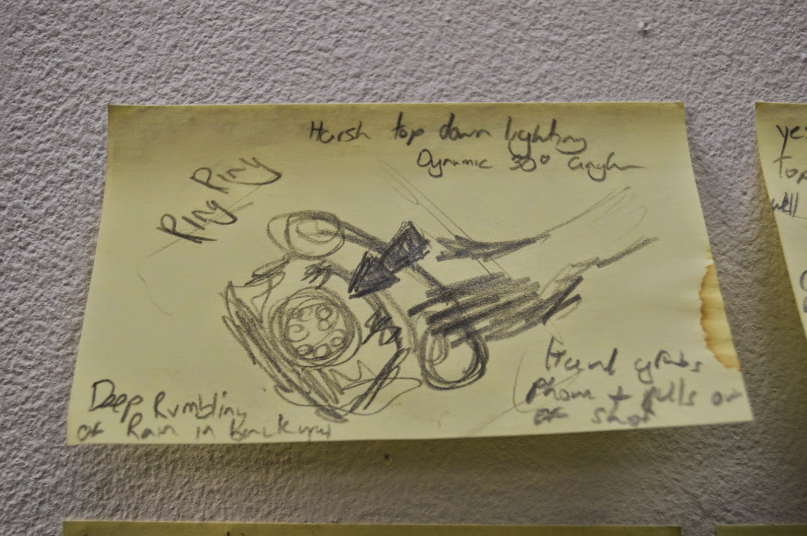
Being the special snowflake i am i wanted to put a bit of a twist on the original rhyme and i decided to stylise it a bit. Being a big fan of the Sin City visual novels and film i decided i wanted to go with a gritty crime story in a film noire style, i was going to focus on strong shadows and harsh light in a 1950's generic American city setting, obviously with a hill involved. The storyline basically went; Jack and Jill are taking part in a drug trade at the top of the hill (the drugs representing the pale of water) Jack gets shot through the head and theres a dramatic cliff hanger where "jill comes tumbling after". Here are a few of the thumbnail sketches of some of the frames;For the last part of the lesson we put up our sketches onto the walls for a peer review, despite most of the class being burnt out and a lot of the comments being relatively half-arsed (Me being guilty of a few lazy comments myself) there were some good constructive comments pointing me towards styles i may want to look at for references and to look at streamlining my ideas, for example less simply writing the direction of scenes and more showing it visually through drawings. Other than that my peers seemed to enjoy my twisted version of Jack and Jill.
When we develop our storyboards further i will definitely use this feedback to improve the quality of mine.
Subscribe to:
Comments (Atom)