Showing posts with label identify. Show all posts
Showing posts with label identify. Show all posts
Monday, 10 November 2014
Mr Scruff Wobble Control
David O'Reilly
Last night i went over to Gavin's house, a classmate, with another friend. I really enjoy going to Gavs because he always has some new interesting animation to show us. Today he showed me a really interesting animation. it was called, The External World, created by David O'Reilly who also worked on an episode of Adventure Time named A Glitch is a Glitch.
There is quite a low polygon count and the movement of non mechanical objects are quite low FPS. The whole show consists of small sketches of different things that are supposed to be happening in the city with themes of shock value, contrast and the taking of things literally, the show almost feels like an experiment of social composition taking situations and twisting them, a common theme in O'Reilly animations. Its target audience is most likely teens to young adults, it comes across as quite experimental, but i for one really enjoyed its shock value and we all has a couple of laughs at different bits.
Moses
Marcel the Shell with Shoes on
The TV show
Daddy Kill The Spider
Having done hand drawn animation myself i find myself really appreciating the amount of work that will have gone into making this video. It doesn't stop me from being a little bit creeped out from it though.
This style of work has become quite popular and i talk about another short film in a similar style to this here
Don't hug me I'm Scared
Don't hug me I'm scared is another short video that portrays itself similar to an educational video for children but has an element of creepiness that caters it more to adults. I talk about an animation here which has a similar style of portraying itself like an educational video but ends up being creepy.
We will start of with DHMIS 1 which is all about creativity. This one starts off tamely and really does feel like a kids TV show. There is a few elements of bluntness which almost feels like a representation of the bluntness of life, but after a small segment where everything goes digital rather than puppets everything gets really dark with images of hearts and organs and death. The shock of this sudden transition is what freaks people out and that freaking of people out is what draws them back to it.
With the second animation the directors realised that the shock value of the first will need to be topped and from the very beginning it keeps its bluntness and its shock value and only adds upon it. I think this part of DHMIS is my favorite.
For the final part i feel they dropped the ball. I feel they swapped obvious bluntness and shock images for a more psychological feeling and i think the quality falls because of this. No doubt it is still entertaining but i really think the second one is better. I do like the cultish nature they introduce nearer the end but i would have prefered a bit more of a build up rather than a sudden plot switch.
Bob Ross' Layers
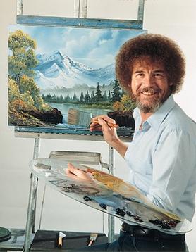
Another link i made was how similar his paintings look to the traditional backgrounds of old animation films, they have a similar slightly blurred out feel and the use of brush strokes to give the impression of objects. For example the below images are a background for a scene in The Fox and the Hound and a painting by Bob Ross.


Though Bob Ross' style can easily be seen, the similarities between the two images are great, particularly the clouds and distant parts of the images which are both very blurred and there is a lack of bold outlines or much of an outline at all, which contrasts with the outlines of the animated characters.
The Adventures of Tintin
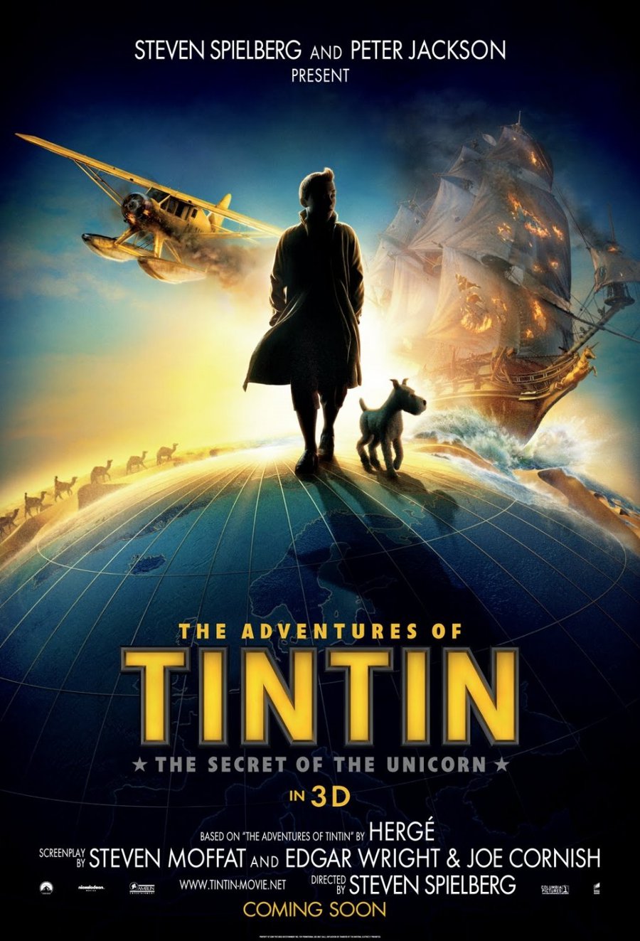
The uncanny valley is a theory behind why we feel so uncomfortable with things that take human form but aren't human. Films such as The Polar Express show a lack of understanding behind the uncanny valley, the characters are a human shape and move very similar to humans but the eyes have a lack of humanity about them which adds an element of creepiness.
The Adventures of Tintin however shows an understanding of the uncanny valley; though the characters move very close to humans the facial shapes are exaggerated, overly large noses, overly small eyes etc, furthermore the action scenes have a slapstick loony-tunes feel to them with a lot of variables reacting in such a way that the characters are unrealistically lucky, a trope that is fun at first but soon gets tiresome.
Overall i found the story to be relatively average, a boy goes on an adventure and finds treasure, defeats the bad guy etc, but the understand for the uncanny valley and the characters movement really draw me into this film, and i am definitely looking forward to The Adventures of Tintin 2.
Sunday, 9 November 2014
The Reward
But in all seriousness i do really love this animation and i feel it has altered my philosophy as a person. The animation is about two strangers becoming friends as they go on a epic adventure in the promise of treasure. Though they have a rocky start they become proper bros and in the end when they finally reach their destination, they realise that the treasure was no physical object, it was in-fact the journey itself and how it helped them grow as people. This idea of growing as a person through travel is something i plan to do after university.
Two key parts of this animation apart from the story that i want to talk about is the FPS and the world design.
The movement of people seems to have quite a slow framerate, if i had to guess i would put it around 12 or maybe even lower. The fact that its low is not what interests me, its the fact that its still effective at conveying movement and emotions of the characters despite seeming relatively "choppy".
The world design is great. It has everything i love in regards to art pieces; vivid colours with great contrast, imaginative fantasy design and an overall light hearted feel similar to that of Adventure Time or gravity falls. I particularly love the design of the vertical city, it reminds me of the descriptions of the cities in the Mortal Engines Quartet.
I'D GIVE THIS ANIMATION A 235432/10
Friday, 7 November 2014
In Between
The animation itself has a lighthearted feeling (despite being a potentially difficult subject depending on how deeply you read into it), which i believe is from the light pastel colours and how smooth the movement of the characters feel. The crocodile itself is animated enough to feel like a nuisance, whereas the people move more meaningfully with the occasional mannerism thrown in. This is clear in the first scene in the psychiatrists office where the only movement is the lips of the character and his hand tapping a pen.
Overall i find the animation to be well executed if a little same-y since it has a feeling of traditional 2D disney animation, however i feel the subject of the animation is well addressed and put under a creative light in order to keep it lighthearted. This will be an animation that will stick with me into my adult life.
Thursday, 6 November 2014
Nyan~ Neko Sugar Girls; The Worst Animation EVER
Last night at Gavs house we watched probably one of the worst animes i've seen ever and i was desperate to talk about it on my blog so what i thought i'd do is run through why this animation is such a travesty with the knowledge i have so far as an animator.
The first thing that we're hit with is an intro song which seems too good for the quality of the rest of it, according to Gav it is a song from a Japanese fighting videogame however i couldn't back this statement up with any evidence. Once the intro is over we hear the voice acting which is riddled with peaking puffing and popping, most likely due to a low quality microphone, furthermore the volume levels of each of the characters are extremely different which can be extremely jarring during a dialogue between two characters. The language of the characters is beyond belief, all of the characters' speech is spoken with some kind of fake accent that doesn't seem to similar to any real life accent, though the badly pronounced occasional Japanese word hints that it may be an attempt at a Japanese accent. The final outro seems to be a mix of all of the issues i have already listed with some badly played musical instruments thrown in too.
The animated quality consists of only key frames with a slightly altered duplicate to attempt to give a sense of realism to the characters as no real person is completely still, however there is nothing else, with some shots consisting of only one frame at a time, i would talk about how the creators uses the 12 principles however it seems that they've all been ignored for the most part.
The art of Nyan~ Neko Sugar Girls is extremely terrible, all of the characters faces and bodies are extremely badly proportioned with the volume of different parts of the characters seeming to change from shot to shot. The bodies of the characters mostly consist of rectangles, with two large balloon like objects for breasts on one of the characters. All of the drawing and colouring seems to have been done in MS Paint with very clear issues that happen with working with MS paint, like some pixels not being properly coloured because the colour is only a few points away from being pure white, and a very difficult to work with colour pallet. There is no shading apart from a large dark shadow under the breasts of the girls which seems not to follow traditional lighting rules, hinting at the possibility of this anime existing in a dimension where the laws of physics are not the same as our own.
The story line is very difficult to follow, mostly because the voice acting quality is so terrible, but after looking up the plot on google it seems i didn't really miss much. The plot consists of two cat girls named Raku-Chan and Koneko-Chan who hang out with a guy named Hitoshi-San. Hitoshi gets kidnapped by a man who plans to rape him (Hitoshi later begins to have feelings for his kidnapper which makes me feel uncomfortable as it trivialises rape). He gets saved by the girls but Then Raku gets bitten by a squirrel, and everyone thinks she gets rabies, but actually a "neko demon" is inserted into her body.
Overall this anime is a mess, but it's a lot of fun to watch when drunk and is a very good pick me up when we are beating ourselves up about our own work. At least we will never create something as bad as Nyan~ Neko Sugar Girls.
Subscribe to:
Posts (Atom)