Pages

Thursday 19 March 2015

Visual Language 21: Colour theory

Colour theory is a theory that colours mean different things and react to each other in certain ways. Each colour has its own psychological features such as blue making the viewer feel trust, loyalty, wisdom and sadness. Furthermore colours have different temperatures and can make images feel cold or hot depending on whether its on more of a blue/green scale or red/orange scale. 
It also comes into mixing colours such as additive colour mixing or subtractive colour mixing. Additive means that the main three colours are red green and blue and mix to form white, while subtractive colour mixing mixes cyan yellow and magenta to form black. Additive is mostly with computers and lights, and subtractive is paints, printers and everything else.
Colours consist of primary colours, secondary colours and tertiary colours. Primary colours are blue red and yellow, secondary are the result of mixing two primaries together, this consists of orange green and purple. tertiary is everything else. Colour wheels come into play when considering colour opposites, these are the colours that contrast most with each other. These can be found on the exact opposite of the colour wheel.

Visual Language 20: Form, Flow and Force research 3: Rayman Origins

Rayman is a unique character in the sense that he doesnt have arms or legs, he only has hands and feet. This leads to some interesting effects when making him run and punch. This makes the fist movement a lot more emphasised with more blur and secondary movement. Furthermore the world is extremely vibrant and active so everything seems to be very bubbly and bouncy.

Visual Language 19: Form, Flow and Force research 2: Prince of Egypt (Chariot Race)

After watching the prince of Egypt again recently i noticed how good the animation is for its time. I wanted to talk about the chariot race scene because there is a lot going on and the way the characters are animated to react to certain movements of the 3D rendered chariot i found very cool. They move very smoothly when reacting to curves and slight inclines but still react to jolts of the chariots knocking together. Something very else that i found interesting was how smooth the animations for the characters were yet the horses seemed to be a lot choppier, perhaps they needed more reference for the horses animation.

Visual Language 18: Form, Flow and Force research 1: Thought of You

Thought of you is an animation of two people dancing. The two people seem to represent two different elements, the woman who seems to be air flows like a cloud, slowly and lightly and the man seems to move like water, smoothly and with a lot of easing in and out. Together them dancing is very pretty, every movement has some kind of follow through action to emphasise it. At one point the woman becomes a light strand and this emphasises the flowing movement of her without constraining movement to joints.

Visual Language 17: Form Flow and Force

For this study task we had to do some life drawing. I'm quite confident in my life drawing skills so i looked forward to it. 
We started by drawing a few poses of someone as they move through a space, giving each drawing 10 seconds each. This was a lot of fun and i was left with some really interesting figures and shapes.
We then drew people expanding and contracting with 20 seconds per pose this time. Again i think this gave me some really interesting pieces. 
Then we drew 15 minute poses of people pulling and pushing objects, showing a force which though i think my images are a good quality i don't think they show pulling or pushing very well.
Finally we drew a 30 minute pose which was also successful.

Visual Language 15: Take 5 Feedback

As with a lot of crits my feedback was generally quite positive however i was thankful to get some more negative feedback this time in regards to each animation.
I started with sound 6. People liked the shake effect and thought it represented the sound well, but they didn't like the top line being so static. I wanted this to represent the slight background hiss but perhaps i needed to make it move a little more to represent it.

I then showed sound 12. People generally agreed that this one felt rushed and too messy, they thought the colours were fine but my line was too all over the place, furthermore they didn't like how the "rain" was all one layer. These thoughts were similar to that of my own.

I then showed sound 18. Everyone liked this animation and there wasn't much negative criticism given, however Mike voiced that he didn't like the glow effect along the right side but i am still adamant that it was the right way to go with it.

I then showed sound 33. Everyone thought my colours where on point but felt that there wasn't enough movement to represent the sound, and looking back i have to agree, two lines doesn't feel like enough to represent the sound. Mike also said that he didn't like how my line got a lot lot looser as the animation plays, and i agree that it has a negative effect on the animation, though i intended for the line to become a lot smoother it feels more like i began being lazy as time went on rather than an intentional part.

Finally i showed sound 43. I got one comment saying that they didn't like the moving square. I ignored this comment. I also got a comment on the quality of line for my meteorite like object being a bit too rough and wishing it would be smoother and i agreed with them.

I found this crit more useful than previous ones because of the less positive feedback. I hope to have a similar experience in later crits.

Visual Language 10: Take 5 Planning

I started by scribbling out some shapes and lines and generally just experimented with a few different materials while listening to the sounds, i also used my own descriptive words to try and describe the sounds.
 After this i began looking at the lines i created and tried planning out some images to represent my sounds.
 I then got some of them down with some colours, again experimenting with colours and materials.

Once i had finished i went back over my images and made some notes for the animation to be more effective.

Wednesday 18 March 2015

Visual Language 16: Turn Around


For my turn around i did my shoe. Its extremely scruffy and i wanted to have that represented by a looser line, however the animation i feel was not hugely successful, mostly due to my own line being a little too loose for an effective animation. Though the stills arent too bad, they still feel extremely rushed and a little lazy however i don't think i will be able to get a better turn around done before submission. I will however most likely do my own turn around in my own time with a different subject.

Visual Language 8: Environmental Storytelling 3: The Grand Budapest Hotel


I am a huge fan of Wes Anderson's style and the Grand Budapest Hotel is an accumulation of all the successful elements of Anderson's past movies all rolled into one. The Precision of his Camera work, set and costume design and acting are all evident throughout the film. Theres so much going on that i am having trouble where to start.
Wes mostly takes influence from old cinema for his social interactions in his films such as positioning of the actors and line delivery, furthermore the special effects of this film is supposed to emulate 50 year old filming and special effects techniques such as models and panted backdrops. This shows how despite no high end effects being used a successful film can still be created.
Colour is used a lot in the costume designs of characters, the antagonists of the film all wear black or otherwise very dark clothes whereas the neutral characters and protagonists all wear very bring clothing.

Visual Language 1: My Sketchbooks

After working on a range of sketchbook sizes this is what i thought about each size. I mostly prefered working in the large square sketchbook and the A4 sketchbook however i did enjoy working in the long rectangular one and the smallest square one.

Tuesday 17 March 2015

Visual Language 14: Take 5 Research 3: Mr Scruff

Mr Scruffs illustrations are very simplistic, and his animations consists of key framing these still images in a program like after effects, however the timing of when these animations begin or end often have some relevance to the song. For example when the double bass comes in a little person playing the double bass comes on screen, when the drums come in theres a little man on the drums, with music notation coming away from these characters.

These animations are designed to be simple so that it doesnt distract from the music itself yet still provides some visual entertainment. Furthermore Mr Scruff is a lighthearted man and his animations reflect this, they don't make any complex movements and they don't ease in and out but they give indications for when certain musical keys come in.

Visual Language 13: Take 5 Research 2: Fresh Guacamole By Pes

In Fresh Guacamole Pes uses toys and other non vegetable/fruit items to make guacamole. I chose this animation to talk about for our sound related module because i think the sound of this animation is very important. Though the objects aren't what you'd traditionally use to make guacamole the sounds that the objects make are the same as the sounds of the objects they mean to represent, for example the baseball (which represents an onion) sounds just like how an onion sounds when you chop it, along with the golfball/lime's Squeeze and the Casino/Tortilla chip's crunch.

Without these sounds i feel the animation would be a lot less successful, since the sounds makes the slicing of objects satisfying.

Visual Language 12: Take 5 Research 1: Bit.Trip Runner

Bit.Trip Runner is a game in the Bit.Trip series, a series of Rhythm games in which music or sounds play a major part in how the game is played. In Bit.Trip Runner you play as Commander Video, a simplistic character with no obvious goals. You control him as he runs along your screen and you choose the make him jump, kick or activate obstacles to get out of his way. As he does this it produces a specific kind of sound which adds to a constant beat playing throughout. Furthermore picking up gold also gives a specific note. There are also little orange block that when you pick up make the beat a little more complex. In doing this it makes the player feel a little more pumped up. Furthermore the more complex the beat becomes the trail behind Commander Video becomes more intense until it ends up as a rainbow as seen above when you collect all the orange pieces. This makes it feel like the player is contributing to the song being played and i feel gives the satisfaction similar to that of playing a musical instrument.

Visual Language 11: Take 5

For the take 5 brief i chose my 5 sounds. I chose sounds; 6, 12, 18, 33 and 43

I started by animating sound 18.
I animated this in after effects using some layers of lines i created in photoshop. I wanted to keep it quite mechanical looking but because i could hear the levels changing in the audio i wanted to change the levels of the lines in order to represent each layer of audio i heard. I also added some glow effects to further give the electronic mechanical feeling i wanted. Overall i am quite proud of this sound.

The next sound i animated with sound 33.
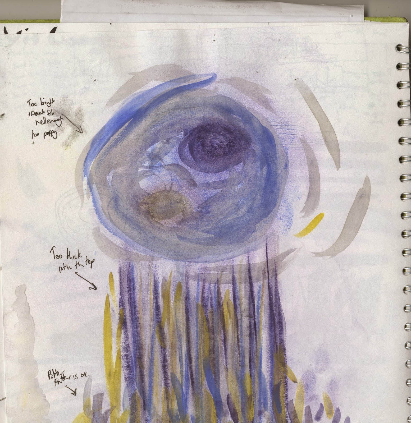
For this one i animated in photoshop as i thought the sound was a lot more natural so i wanted to keep my natural line in there. I picked out the colours because i thought they represented each sound the best and i wanted to keep a white background because of how little ambient background sound there was. After getting some feedback from Mike i realise that my line slowly loses the quality it started with which wasn't part of my plan and i don't think it adds anything to it so i will go back and change this at some point.

Next i animated sound 12.
i feel this was my least successful animation, this is because i rushed it and didn't put in as much effort to experiment with more than just a handful of layers. The thump noises at the beginning was how i imagined the sound but i felt the rain like sound after this was more layered and random however due to the fact i only used one layer it feels extremely two dimensional and not as dynamic as i wanted it.

After this i animated sound 6.
For this animation i am quite conflicted. The final animation was exactly how i had planned it out, however it feels extremely plain. I am unsure if i didn't animate the sound correctly or i just perceived it as a plain sound however the movement in the animation is exactly how i wanted to as the shapes shake as the sound buzzes when it hits a certain frequency but otherwise feels extremely plain.

And finally i animated sound 43.

For this animation i used a hybrid of photoshop animation for the circle movement and keyframes in after effects for the square. I regret my choice of background colour, though i did mean it to be quite drab i didnt want it to be as intense as the colour is on the final animation, furthermore i wish the curves of the circle movement were smoother so i will most probably go back and re do my line work, however i feel the sounds get represented in this animation.

Visual Language 9: Set, Series and Sequence Feedback

The feedback i got from the group for my images i showed for the set series and sequence brief were all very positive, they liked how much i experimented with different media and how much of a range of subjects i had used for my images. I would have liked some more negative feedback though as i feel this is what really improves work, the only negative feedback i got was about not having the last 12 images done on time which was quite annoying despite how much of an ego boost the feedback gave me.
No work is perfect and next time i'd like to see some more feedback on improvements i could make.

Visual Language 7: Environmental Storytelling 2: Dark Souls

Dark souls is a difficult game. It is a game where every move you make matters, and if you make a mistake, you die. So naturally, in a game where you need to weigh up your odds before taking on a certain environment you want as much information as possible. Dark Souls is fantastic at environmental storytelling, from the burn marks on the ground and charred corpses to hint at immanent danger to the corpses at the bottom of long drops to hint you might not come out alive of this one, dark souls is constantly giving you hints to the dangers. Not only this but there is an item in game that lets you write notes to come up in other players worlds for you to give them hints to treasure or perhaps bring their downfall.

Not only is the environmental storytelling fantastic at warning the player of danger, its also fantastic at giving us the lore. Like most successful storytelling techniques, none of the lore is completely out in the open, a lot of it is up for the player to decide their own theories on how certain events took place, how certain items get to certain places. A lot of difficult terrain in the land is a result of the fact that it was once ruled by giants, so a lot of the difficulties you have getting around the land is because you are a normal sized man in a giants world. This add more difficulty to the game but not in a bad way.

Since i have played dark souls i have followed a youtube channel called ENB or EpicNameBro (Link here) of whom plays through the game but also speculates every tiny bit of lore he comes across and would highly recommend watching to get more information on the vast lore of Dark Souls.

Wednesday 11 March 2015

Visual Language 6: Environmental Storytelling 1: Limbo

Limbo is a videogame that uses environmental storytelling. Its an entirely monochrome game that uses parallax to show environments. Darkness and light are huge parts of this games style with the use of contrast to tell distance and importance of objects. The soundtrack is dark and ambient and often very quiet in order to convey the lonely and hopeless feeling that the game intends to convey.


The game uses simple hints to make the player aware of certain dangers, however many of these hints are not obvious and the player may have to die once or twice to fully understand the whole environment. In the above picture we can see how things in the environment give us clues as to what dangers or what parts of the environment need to be used in order to continue on your journey. We can see that something is magnetic with the symbol of a magnet to the side, and also with the light being pulled towards a noticeably different surface. This helps us work out that we need to attract the block at a certain point in order to continue.
Similarly in this image we can see the simple use of icons to show there there is an element of danger somewhere and we need to be careful.
In this image we can see a segment of the game where almost all vision of your surroundings is taken away. This part of the game makes you naturally uncomfortable because the telltale signs of danger have been taken away, making this segment a particularly tough one.

Monday 9 March 2015

Titles 6: Storyboard


This is the storyboard i have developed for my animated intro. I think it shows the setting of london and at the same time inspires adventure and curiosity that i'd like this title sequence to convey.

Titles 5: Architectural Consideration

after getting some ideas together with my mood board i decided to compile some collections of images in different styles in the folders you see above. I can use these as references when it comes to planning out specific buildings in different shots, with different levels of detail for each, for example my brutalist/utilitarianist layers will not be featured much so i can focus on the basic shapes more than the specific shapes of say St Pauls or the Natural History Museum that will be a large focus in my intro

Titles 4: Moodboard

After getting some notes for things i wanted to look up, i looked them up. I found a range of concept art and some film screenshots and picked out the elements i liked.
I looked at treasure planet because i liked the design of the buildings and airships and thought it would work well for the airships and nobility in London. While also researching treasure planet i discovered their use of the 70:30 rule, a rule in which 70% of the design is traditional style while 30% is sci-fi.

I then looked at fallout for its use of both oldschool buildings held up with new technologies and materials for the natural history museum and St Pauls Cathedral, and also its use of the vault system, for its orderly yet oddly dingy and gross feel for the lower working levels of London.

Afterwards i looked at howls moving castle for the fact its a large moving structure however i fould its design and animation too cartoony, and i want my design to feel quite dark.

Finally i looked at Oblivion for its design of the wastelands. I liked oblivions designs because of its almost completely untouched look, with only hints of an old civilisation with ruins, a barren yet alive landscape. This is something i would like to carry over to my animation.

I am going to look more into the architectural styles for each of these individual references to understand the shapes of buildings.

Sunday 1 March 2015

Titles 3: spitballin'

For the first work i have done for this project i have created two pages where i do a mixture of taking notes from the book, doodling ideas and potential sources for reference images and video. This can be seen below.
I started with some general ideas, the first page i noted down key features of the book and some doodles of key features too.
On the other page i made notes firstly on how the first few chapters of the book go in order to get an idea for what to focus on in the intro and keywords and phrases for specific areas of the book. I then looked up some films and techniques for concept art.