Pages

Thursday 11 May 2017

Unfinished scenes

Deadline is hours away and unfortunately I have a lot of assets i wont be able to animate so i thought it worth quickly noting the work i have that i will animate after deadline.
My plan for the first scene where this guy appears was to animate an aperture door opening and a layer over top for the exterior of his house and layer underneath for the interior. He would remain very static for this first shot which is why the asset is already in the animation im submitting.

The plan for George the Tortoise was to animate him in after effects, he has seperate layers for his head, neck, and feet so it will be quick and easy to animate him in the future, i just don't have time for submission.

Car Effects animation

for the shots where we see the car through normal vision i wanted to try my hand at some effects animation. I wasnt overly happy with the effects i had already done and thought this would be something worth exploring. I first looked up real footage of elements i wanted to put in, such as a jet engine afterburn and dust being kicked up, however i was quite unsure how to do either of them, especially the dust cloud, so i decided to look up others frame by frame animated effects to try gain some understanding.


i particularly liked this laser effect, i will remember this one for if i want to go back and re do the catch a ride laser projection frog thing.


i began work on the afterburn as the shape was relatively consistent and changed colour so i decided to work on that. First i made notes on the way colours come in in the source video, i then produce assets in photoshop, two frames for each element so that i could make it flicker.

After all assets were produced i animated them change opacity while flickering over each other, i applied a lateral wiggle, and then a glow effect, and all in all i am incredibly happy with the way it looks, however it took such a long time for such a small part of the shot that i am unsure how much more i will be able to get done. I will certainly work more on effects animation after submission, but i doubt i will have time to do much more now.

Press Pack

The press pack was a very interesting thing to produce, ordinarily i would have preferred to give myself a little extra time and furthermore work with a graphic designer and/or an illustrator to produce a poster, however due to the deadline being in two days and with not enough assets to give anyone else it would be unfair to ask someone else to produce a poster in such a short time frame with such little material to go on. That being said i think i have done particularly well with this poster. I took influence from animation poster such as Up, Ponyo and Little Mermaid which all have quite simple designs. Making the poster also helped me pick a better font, while i dont have time to change the text on the need a ride scene it will be something i can change in the future. I also tried to put in my logo but it didn't really fit in anywhere very well and i am happy for this to be a rough design i alter in the future.


For the four stills i tried to pick ones that were most visually interesting and wont as featured in my trailers, i ended up choosing these four.


Next up was the trailer, for the trailer i initially wanted to make essentially a moving poster to sit on my social media and in the background of a website. I used the assets from the need a ride scene in space to write the title and coming soon, with the occasional text glitch. I would have liked to make the sign rotate completely as to have a seamless loop, however the space station was traveling at a different rate so would not have looped anyway.


Annabeth suggested however that i try to include some of the more frame by frame animation i had done, so i made another one that shows a little more of the action with a small build up and punch line whilst also giving the tone of the film. While shorter than the 30 second loop i feel like it is just as effective.

Next was the Bio, which had elements i was unsure about, however this is because i struggle talking about myself. I feel that i have created a bio that serves me well, not too big headed whilst also not underselling myself, i also kept the photo as loose as possible because it suits my personality for this project well;


Ollie Simons is a Leeds based animator, illustrator and general creative person. He is a generalist animator with experience with all forms of animation while predominantly focusing on digital 2D. He is also experienced with video and audio editing. His future goals are to work internationally, particularly in America and Japan in order to understand their methods of producing animation for an adult audience and hopefully produce similar animation, based in the UK. His previous experience includes producing animation for Light Night, and working with independent musicians to create music videos.


After this i worked on the synopsis for the animation which i tried to keep quite informal because i feel like this would work much better for an online audience. I then decided however that an online audience would be much longer so i also produced a one line description to go with online uploads, however it is pretty weak and needs to be reconsidered:

SYNOPSIS
Have you ever ordered a packaged and wondered how the delivery man’s journey went? Probably not, but when alien planets, dangerous thugs and a train/truck/car/tank’s involved it’s sure to make things interesting. Follow a delivery driver from the future as we see the troubles he faces to do his job. Special Delivery merges elements of American animation, taking influence from shows such as Rick and Morty and Bobs Burgers, with elements of Japanese animation with shows such as One Punch Man and Kill la Kill in order to make the most badass and funny indie animation you’ve seen this year.

SYNOPSIS FOR YOUTUBE/VIMEO DESCRIPTION

Props to delivery drivers, they really do go above and beyond.


Wednesday 10 May 2017

Finally, a coloured frame by frame animation

Due to looming deadlines and the need for more footage for a trailer and with advice from Annabeth i decided i needed to colour one of the rough animations i have done for some trailer material. I chose the scene in the car as i felt that this scene would serve well as part of the trailer as the hitting of the head action is quite short and i want a short a snappy trailer to go along side my initial plan of a long slow trailer.

After colouring a lot of clear problems with the animation arise, such as the lack of inbetweens and some face shapes going funny, furthermore the eyes arent nearly as defined as the initially sketches when closed, but seeing everything coloured is incredibly satisfying, it is a shame i wont be able to manage to fully colour any other longer animations before submission, however i will be able to complete it for the end of year show.

Future Plan

After the submission of this module i will continue to work on this animation and aim to have it complete for friday the ninth of june in time for the end of year show. My main goal will be to have a fully coloured animation for all scenes bar the ones that i dont want to be coloured. However i would also like to go back and attempt some better effects animation on already completed scenes. I will also begin to post parts of this animation more regularly online on instagram, facebook and twitter.

Tuesday 9 May 2017

Reflecting on my Time Managment

My time managment has been abysmal for this project, but im really not sure what i expected. I had no idea how long to dedicate certain ammounts of time to which is why i neglected to make a gantt chart because i was so unsure how long it would take to make anything i felt it would distract me from my goal and the pressure of uni timetables is enough to unmotivate me without setting further timetables myself. While this does not mean i don't find a use for gantt charts (infact it helped me a lot with a project over summer) because i was so unsure how this project was going to go i didn't make one.

With regards to the amount of time i spend per day animating i definitely wasn't the best. There was a period over easter where i did no work and should have at least set myself a small task to do every day, however the week at Matter&Co gave me a bit of a taste for how much i should aim to work as a professional, and since then i have felt more confident with the amount of hours/work i put into most days.

Regardless i have a lot of work to do, and while there were a lot of times where i did no work, being at a similar level to a few other people on the course makes me feel slightly more confident about my abilities.

Reflecting on my Pitch

having experienced this project now i would have liked to have pitched differently. Hindsight is great for some areas an not for others, a lot of personal problems got in the way of this project unfortunately but those don't get accounted for when the module is marked so... If i knew then what i know now i would definitely have aimed for a much shorter animation. And while writing is an important skill i'd like to develop the focus was to heavy on meeting module requirements and so didn't get the chance to look at areas as much as i would have really liked to. I would much rather have worked on a project that was around 30 seconds to a minute long but with some really nice animation that could have gone in my showreel. Furthermore i've been focusing on effects animation for my latest scene and i am having a lot of fun making animation that looks fluid and clean and nice rather than the long but messy approach most of my animations already seem to be. Furthermore i would have liked to have dedicated at least half of this project to working with others on their project, as not only do i enjoy the change of subject but also it would be an excuse to piggy back off of the high quality off of other peoples work, whist also making my skills more versatile.

Final Crit

This was what i had to show for the final crit. Quite frankly i hate final crits. I am never in a finished position so the Final part is never true, and i never really find anyone to give much critique because it's so close to deadline and no one wants to give each other more work. However thankfully i got some good feedback on the work that i had, and most importantly the scenes i should aim to focus on between now and the deadline, however most of these scenes are quite long and intense so i am unsure i will be able to animate them all but none the less i will focus on them until the deadline.

The list of scenes i have are as follows:
Animate the old man
The car speeding out of the city
The tortoise
The limp to the house
Any scene with the big guy

I also got some feedback about maybe looking at making the car come out of the back, but i think that would be too much pre production stuff so late on. Same with steves suggestion of changing the gag.

Finding sound

Whilst also recording my own sound i also looked up a lot from FreeSound.org, while anabeth wasn't a big fan of the idea i felt like it was perhaps one of the best options to get decent sound quickly, and thankfully you can select the audio quality in the search preferences.

I found that once the sound was part of the animatic i was a lot more drawn in, and the story was much more obvious with an audioscape in the background and quite frankly i felt more motivated to animative with it. Next time i would like to get the audio done quicker so that the goal is a little more obvious.

I also don't understand why others have such trouble with picking sound, its as simple as focusing on an object in the scene, what noise it would make, then add it at the right level, its like building a scene without any visuals but it can be as detailed as you'd like, similar to the Loic Burkhardt talk for Phantom boy at MAF. I particularly enjoy it and i hope to focus on it again at some point.

Sound recording

Sound recording is something i am quite familiar with, so i was exceeding confident going in to it. i felt like my voice didn't work for some things but everyone was a bit too busy for me to chase them up for voices and i also wanted to give voice acting a go. I found it pretty challenging to get the right kinds of sounds whilst also keeping the sound of my voice disguised, but i got everything i needed first try and i feel like it has really given life to the characters.

Character designs on the Fly

While the character designs that i had already produced were satisfactory to get the basic shapes of the characters, as scenes with these characters start to crop up i feel much less confident about animating them without a colour plan first. For example for one of the later shots when we first meet the character receiving the delivery.
This has lead to what i feel to be a pretty unconventional production method of doing the final pre production for the characters just before i animate with them. It has worked particuarly well for this character as his first shot is static so i can simply insert the character design into the shot, however the shot of the old man, and the shot of the 3 thugs will have be coloured whilst being animated, perhaps using the first frame to work out final colours. 

Styles and Backgrounds

 One thing i would say i have really struggled with is keeping consistent style, initially i wanted everything to be quite textured, mostly after being inspired by Oscars and Joes work however as time went on the less and less i textured things. Furthermore i've switched mid project from giving everything outlines to giving very little as can been seen comparing the first shot i worked on to the latest background.


I even still was struggling very very recently when i made this colour test (much later than i should have)
While consistency is important i feel like it would be much more important that i finish as much as this project regardless of inconsistencies. 


The MC Getting Startled

I feel the same towards this scene as i do about the shot where the MC pulls out the frog from his bag, i feel like i've managed to capture the movement and expression of the MC quite well, furthermore i feel like i have made him fit into the scene quite well, however i just need to actually finish and colour this shot, but for now i am happy with the performance.

Need A Ride sequences

For the need a ride frog sequence i animated mostly in AE again, while i didn't work on them chronologically i will talk about them that way. 

The first shot is still unfinished in my opinion, everything is very static, the green sign beam isn't dynamic enough and the main character should be stood next to a road, however there's still so much to do i will leave it in a more visually interesting version than the animatic doodle.
This shot looks a little more what i want the final shot to look like, however i have some trouble with it, such as the font, and the way the sign initially opens bothers me a little as well, once again it just doesnt feel particularly dynamic. If i were to re do the sign bursting scene i would make one corner burst out a little before the other corner also bursts out before pulling back into the proper sized sign. Either way i have a lot more to do so i will work on other scenes for now.

The Drop Pod

I am quite conflicted about this drop pod scene. While i am particularly happy with the glowing of the heat shield as it heats up and one of the ad signs bursting off i feel like a lot of effects animation still needs to be done, for example i am unhappy with the way that the streaks look as they are pretty static. Furthermore i feel like more effects are needed but effects animation takes a long while and i feel it is more important to get more animation down simply for now. Despite this i feel like it works well as a small clip to continue the story.

Making Assets and using After Effects

One thing i have been doing a lot for this project recently has been making assets and animating in after effects. After my week at Matter&Co i've been on the war path with After effects animation and i feel like i am drawn to it due to the short turn around time. Below is the space station drop pod launch scene which only has a little frame by frame animation for the flames. And for shots like this it works exceedingly well, furthermore animating with assets is something i've become much better at with after effects, however it can sometimes looks a little uncanny and boring. Regardless it is a quick and easy method to animate quickly and i will definitly be using it for a little while longer

Squeezing the frog

Squeezing the frog will be an easy scene to colour and found it particularly easy to animate, while i did have some trouble with the layout of the hands, i've paid more attention to how the shot works rather than how i could draw the hands, and by the scribbly lines you can probably tell i struggled with them, however in the end i feel like this shot will work pretty well in the sequence. Once again it just needs to be coloured.

Finding the Frog

The next shot i animated was the one where our delivery man searches for a frog in his bag after almost getting hit by a car. I was initially quite intimidated by this shot, particuarly as i havent been feeling confident about my work for a while (which has been the reason i've become so slow with this project) however as time as gone on and i have worked on this shot i feel like it is perhaps one of the best performances i have animated so far. I am very happy with the car almost hitting him, and i think the final pull of him getting the frog out of the back looks fluid whist also not using very many frames. I am very happy with what i have and will most probably not add much more to it (even after deadline) however i will need to colour it before i can use it properly for anything.

The Intimidating Roughs

After a small absence from this project i decided the best way to get myself back into gear would be to force myself to do some roughs of the characters i had designed. I thought it would be good to open with this shot as it is essential to lead on to the turn around shot. I am quite happy with the performance, they do feel a little stiff in areas but i also dont want to detract from each of them. I am happy with the final performance however, i got some helpful feedback along the way such as making the large character blink to make him seem more alive.

MORE Character Designs

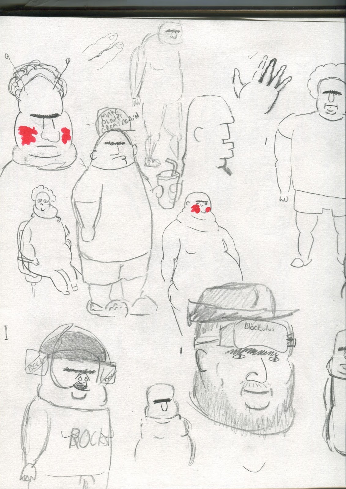
Whilst developing the storyboard i was also working on character designs for all other characters that were going to be involved. I started with the old man, i knew i wanted him to be small so i initially started with small shapes, i also tried both friendly and unfriendly faces as i was still unsure the kind of character i want him to be.


In the end i decided i particularly liked the more square ones, some character designs i really liked but they didn't work for the project, i particularly like the version with the scarf and the one that looks like a bean, however i prefered the particularly rectangular one in the bottom right corner.

Next up was the character who gets the package. I knew i wanted him to be overweight but i was unsure of how to show it while keeping in style with the characters i have designed already. These first few i was ver unhappy with.


however after going back to the idea of using basic shapes and previous reference things started to come together.


Around this point i knew the kinds of shapes i was going to go for, very square with rounded edges (usually wider on the bottom half) with below being the rough designs for both the old man and the delivery recipient.


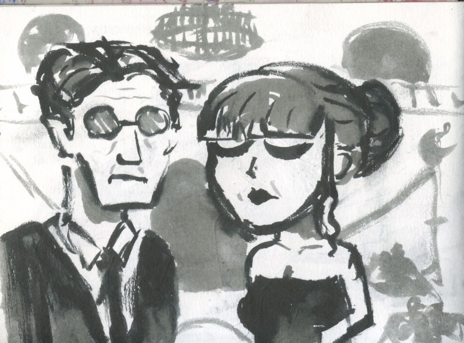
 The last character designs i needed to do were the three troublemakers, i started by doodling elements i thought were intimidating (whilst also trying to keep them quite cool looking)
 These three characters all came together at once, elements in the final characters were in development very early on, such as the use of one eye, big burly charaters and pointy faces.

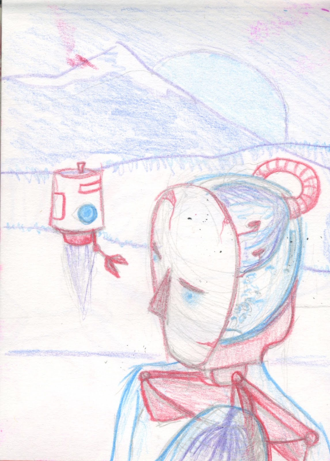
I also noticed that i currently had no female characters, which while i don't see as a huge issue i thought it would be worth designing a woman character as well in order to keep the group diverse in shapes, i also knew a short character and burley character would look good, mostly because i had pretty much already designed the burley character.

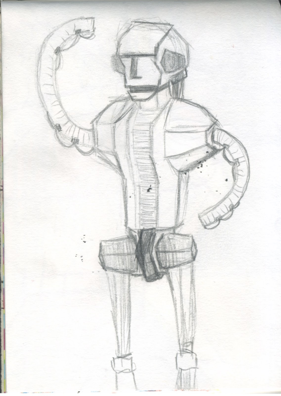
 These were the final character designs, though the gas mask dude is much taller drawn here than i want him to be in the actual animation, overall i feel like i have kept the group diverse whilst also keeping to the same style as each other.


The Computer Screen

Making the computer screen was easy, while i have done scrolling text before this was from a website that is design to look like you're hacking, however for this one i wanted to make custom text so using youtube tutorials and previous knowledge of after effects i was able to make this. I used similar techniques to the snake animations i made for the lifting tower project, only using the characters in the text rather than a path. I also made sure i animated the letter with scale rather than opacity as i found it gave a smoother feeling to the text appearing. One thing i would like to do is perhaps add an effect to it to make it feel like more of a computer screen, perhaps a little grain or some scrolling lines.

The speedy sequence

For the turnaround sequence i decided early on that i wanted it to be limited and rougher than the rest of the animation, where the car is going so fast that the colour has washed out of it, similar to that of the first at the beginning of One Punch Man's intro animation where his fist speeds up and becomes flaming, before finally getting washed out in black and while after breaking through a barrier.
This was the final animation, i kept the lines scruffy as i thought it would add to the idea of the world being altered due to the sheer speed and i thought it worked well.


One thing that does concern me however is the amount of people who keep telling me "i can't wait to see this scene finished" when in reality this is what i wanted the final scene to look like anyway, i will have to see if i can lead the previous shot into this so that it makes more sense, perhaps with the delivery car going so fast it opens a portal in a previous scene.

The Logo

Because the delivery is so important i knew i needed to come up with a suitable logo, after looking at a combination of delivery logos and some space agency logos in order to come up with one for my space agency. I played around with shapes for a while before deciding on an arrow and circle combo, i tried multiple colours but not very much differing layouts. 
In the end i decided this logo would work best for me, as it is very simplistic but also clearly shows an arrow/rocket flying towards a planet, its eyecatching and i feel it works. That being said someone recently pointed out to me that it looks like a very geometric carrot, which while quite funny wasn't what i was going for, however i feel that this design will still work well over the course of a 3 minute animation and we have only picked out it looks like a carrot because we've been looking at it for so long.

The Car Interior

I started by planning over the top of the render from the inside of the car using key colour to differentiate between different areas and types of parts. Red for buttons to light up, blue for lines, and green for monitors. I also used yellow to plan out areas to work on.
Overall i am relatively happy with what i've ended up with, however i feel like it is a bit overcomplicated and im not a big fan of the shot, but i feel this is likely because i have worked on it for so long, regardless this scene needs to be in the animation in order to show the complexity of the car and i can use it as a guide for other shots. Regardless, first scene animated!
I used after effects in order to make buttons flash and the monitors display the scrolling text i made.

Back In Maya

One program i wasn't especially excited to get back into was Maya, however i never had many problems with modeling which is all i really needed to use it for along with a little bit of camera controls, which all in all wasn't too difficult.  I wasn't too fussed about details as i will be drawing over the top of it but i felt like i got the core shapes and necessary elements down quickly. I also took the opportunity to play with some of the lighting as uni now use the Arnold render engine and i was unfamiliar with it. Thankfully with Arnold you can give cameras a fisheye effect which would serve well for the panning scene. The guide i used for this is seen below.
i also used paths and a camera in order to try and animate a nice smooth pan around the car from the angle i imaged and this was the final quarter turn around. 
It took a few different renders, after i finally managed to make the animation smooth so there were no obvious popping while turning i added a few new guides in order to help me maintain perspective, things like a oval for the head, some planes in order to keep a bit of a direction for perspective effects around the delivery car.

Cutting Down the Animatic

This is the Second (and final) cut of my animatic, Many scenes have been cut out/shortened and some have had new edits in order to give them more context or to give the same message as the longer scenes.

I cut out a majority of the initial delivery message with the delivery man getting up, while this would serve as a cool shot is in unnecessary to the story. While it would be a nice shot it is too much work. The rattling in the pod shot will serve as a good enough introduction to the main character.

I cut the crash landing scene as well as i definitely know i wont be able to do the crash justice and thought it would serve as a nice title shot.

I replaced a majority of the car shots including the Simpsons scene with one simple pan of a detailed dashboard, i thought it would serve as a simpler shot to animate while also keeping the details of the car. It would also mean that i can use this shot as a guide to the lay out of the other interior car scenes.

I swapped out the shot going through the roof to instead be a static shot of traffic with the characters who mug our delivery man sitting on the side of the road in order to introduce them slightly earlier and give the same message with an easier shot, I also changed the shot with the three muggers for them to approach the car and give them more of a reason to be antagonists for reasons that make sense.

Finally i cut out a lot of non essential shots from the delivery scene, while also giving the character who recieves the package to have a little more character, and make the gag a little more obvious that the man really cares about the rock that gets delivered to him despite the fact the horizon is littered with rocks.

I'm still unsure about this cut however i cant afford to waste more time figuring out the animatic otherwise i will end up with another COP disaster.

Monday 8 May 2017

The Animatic

After finishing the first animatic i was a bit concerned with its length as it was 4 minutes and 10 seconds long and the timing was very much off, i feel like a lot of the timing will be altered as i animate, however 4 minutes is completely unachievable for this module and a lot is also going to need to be cut out. I will ask people what they feel are unimportant parts and also judge for myself, it will most likely be some of the car interior scenes, that way i can also cut down on car design time, however i would like to come back and animate it in the future as i feel like it would add to the over the top aesthetic, but the submission edit will be a little more comedy focused with some over the top elements.

i took the opportunity to also attempt an element of a moodreel in this animatic with the simpsons pimped out icecream van scene which translated the vibe i was trying to get with that part but i feel like it fell short, but a moodreel would most likely be an effective early pre production tool to get the mood down quickly.

storyboard

One thing i wasn't expecting while storyboarding this project was how much longer it took because of the length of new animation and some of the dynamic actions i wanted to represent with my storyboard. While the project i took on over summer was double the length of how long i plan for this animation because the movement i wanted was much less dynamic it didn't take nearly as much to show the same story. In the end, (counting the panels i went back and added in or changed) i ended with 134 panels (115 without later additions). Furthermore the ammount of time i took to do my storyboard was much longer than i would have expected. It took me around three complete days to finish the storyboard, i feel around this time my work ethic wasnt very good however and could most probably make something to the same quality within 1.5 days having learned this.

Thursday 9 February 2017

The Art Book

making an art book was quite a new experience for me, i felt the turnaround time was way too short, and the skills that i gained from the tutorials, and knowing more about the print workshop would have been more useful to have learned in first year, regardless putting together this art book has taught me a lot and i definitely hope to make another one in the near future. Below is the art book.

Daily Doodles

Over the past few months i have been producing doodles in order to boost my instagram numbers, boost my imagination and generally push my arty side. After using a few doodles and being happy with the way they work with my project i began looking at others that could be applied to things such as background characters, machines and just general stuff that could be used for this project. All the daily doodles i felt i could use somewhere in my animation are seen below.