Thursday, 9 February 2017
The Art Book
making an art book was quite a new experience for me, i felt the turnaround time was way too short, and the skills that i gained from the tutorials, and knowing more about the print workshop would have been more useful to have learned in first year, regardless putting together this art book has taught me a lot and i definitely hope to make another one in the near future. Below is the art book.
Daily Doodles
Over the past few months i have been producing doodles in order to boost my instagram numbers, boost my imagination and generally push my arty side. After using a few doodles and being happy with the way they work with my project i began looking at others that could be applied to things such as background characters, machines and just general stuff that could be used for this project. All the daily doodles i felt i could use somewhere in my animation are seen below.


Beginning the Car

My final design was an amalgamation of masculine and over the top elements from tanks, trains and trucks, with a strangely beatle like back. i also wanted to keep a slim windscreen as i feel like this further portrays an over the top large engine, similar to that of hummers and trains, exchanging power for safety and sight.
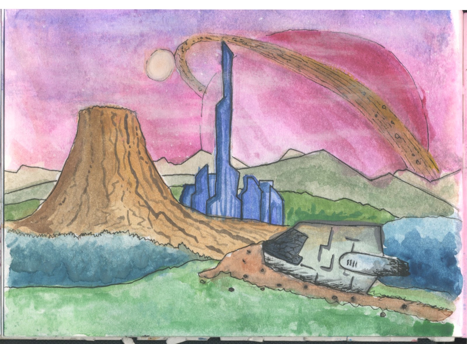
The Planet

After finishing the main character i thought it would be important to begin on designing the planet. This proved difficult as perspective drawings of landscapes isnt my strong point. Furthermore the pressure of the pop up show means i most likely wont be able to produce a finished work for it. Above was my latest drawing of a potential landscape. However i had also realised that i have plenty of drawings that i have been producing for my daily doodle project which could easily work as concept art. Not as a "oo quickly shove some extra work in to make it look like i've produced more than have" because these drawings were produced as i was thinking about this project so have obviously taken some imaginative versions of my idea rather than a researched set of concept art.


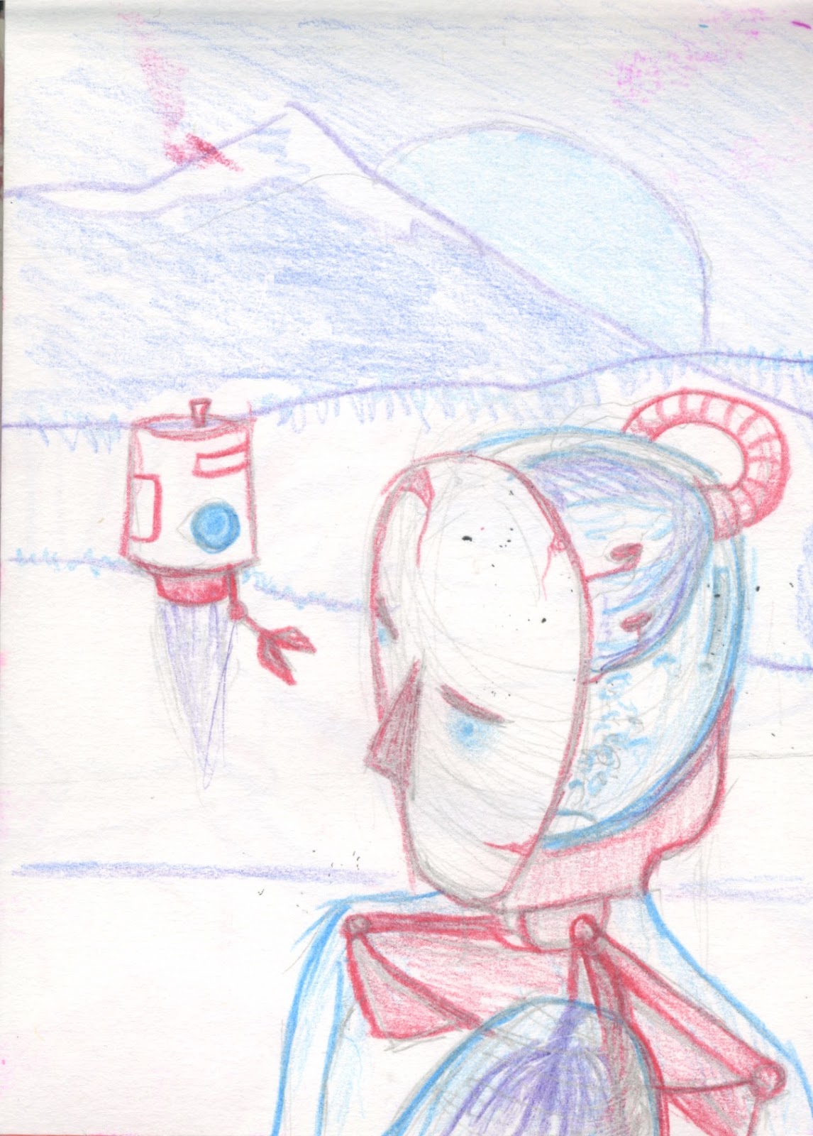
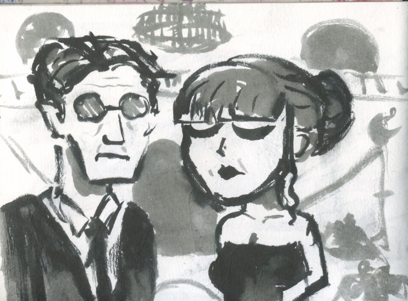
Character Design 2
Today i finished my main character. He looks particularly plain which is exactly what i was going for, and i am happy with the linework which is the most important at this stage.

At first i experimented with greens, i want the rest of the world to really have a strong opposing pallet, and as i only have blue and red right now, green would offset this well, however the character looks a little too boring with these colours. I want him to not fit in but not to look boring.


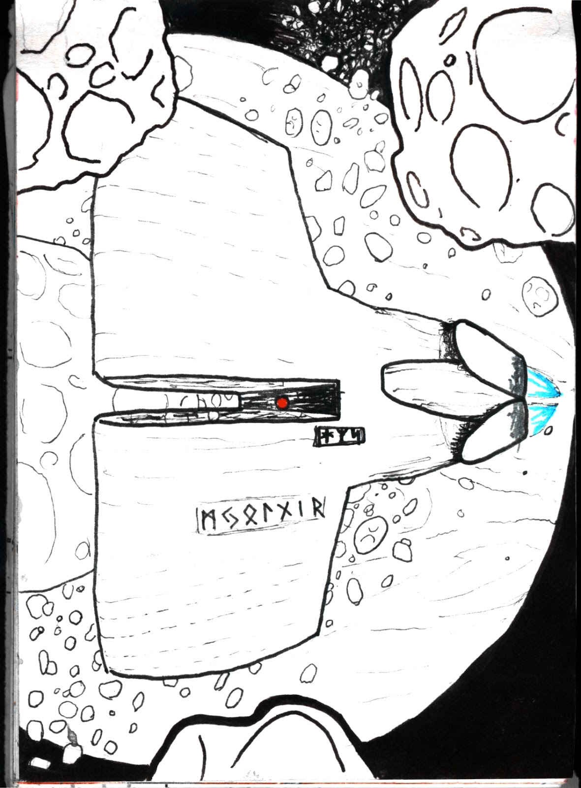
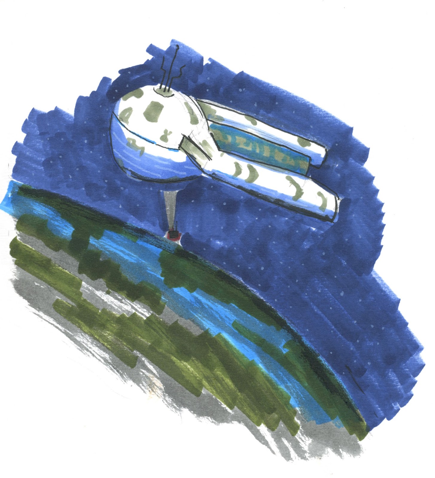
The Space Station

The first piece of coloured concept art i produced was this one above. I want the animation to be sci fi so i want the delivery man to start in a space station. This initial first drawing was to help determine colour schemes for the planet and to try out textured brushes. These tests can be seen in my art book.
I then decided that i should come up with a different design and i didn't find the original interesting enough, so i started by drawing out silhouettes of interesting shapes for space station. I took influence from a few spaceships in particular, namely the Icarus 2 from Sunshine, and a more boat looking design similar to Gurren Lagaan. I also added a layer with neon signs in order to further experiment with designs and was particularly happy with the spire looking space station.

I utilised the brushes i used for the planet designs in order to come up with my "final" design which while i am quite happy with this space station it looks incredibly over the top and complex and looks much better when it was a small simple sketch, i need to do more experimentation but because it wont feature a huge ammount in the animation i need to focus on developing different areas.

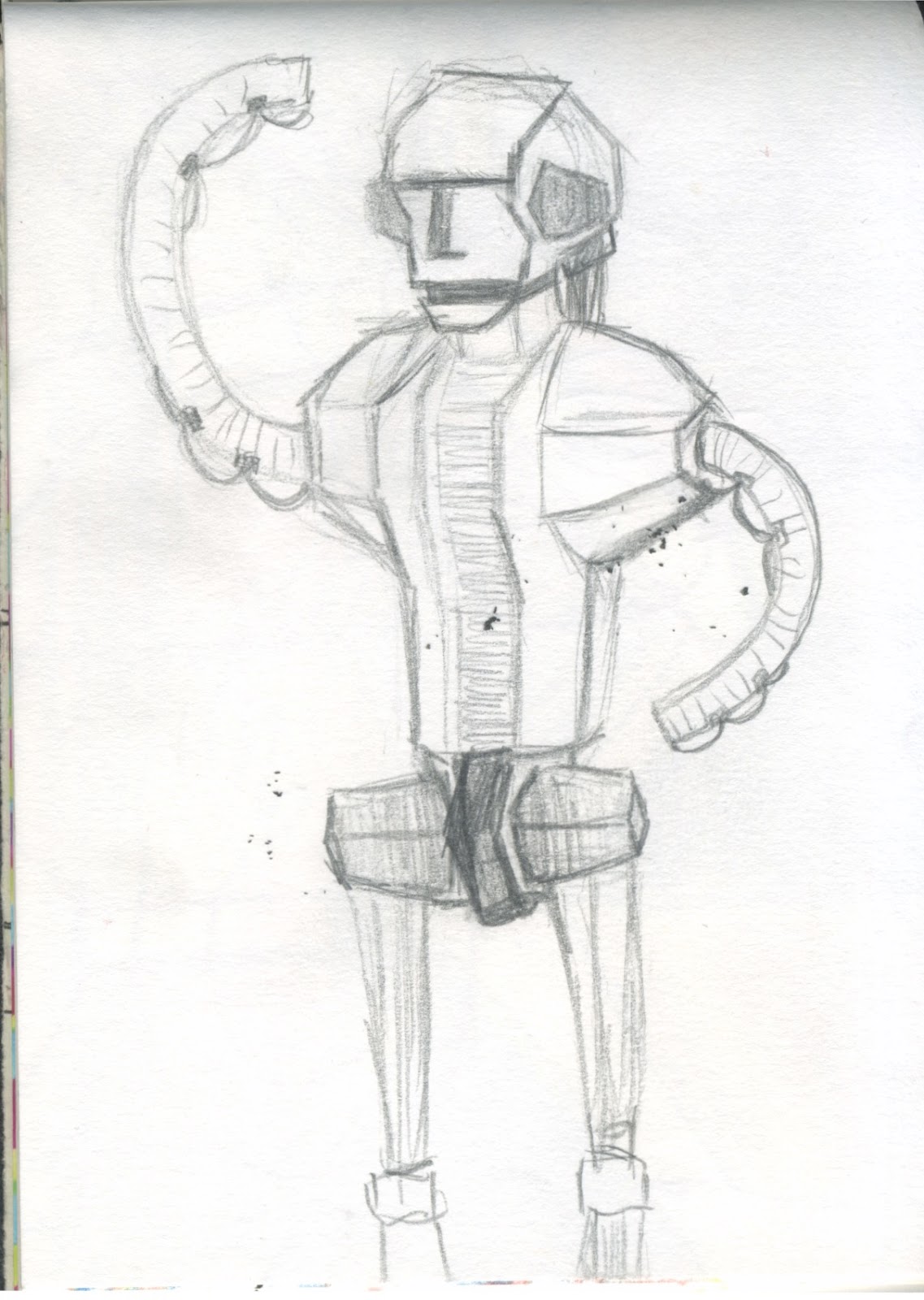
Character Design 1
The first thing i began working on was the main character. He takes the role of a run of the mill delivery guy, with influence from Futurama’s Fry, and Squeaky-Voiced Teen from The Simpsons. I wanted to keep his design simple. This simple design would contrast with the wacky world around him, furthermore he will react unenthusiastically to everything around him, to hopefully add a comedy element. The design of him went through many itterations, with the two main ones being the one with the large square head, and oval face with the large cap. Another important element to consider is the complexity of the character. As the main character he will have a lot of screentime so it is important to keep him as simple as possible in order to make animating him a realistic job.


Finally a Solid Idea
After a little too long i have finally organised my idea for the animation. The story goes something like this:
It's about a space delivery man who gets tasked to go down to a planet to make a delivery, he gets dropped from orbit but it's a pretty regular thing for him so it's all very deadpan, once he arrives a small old man drops off a super badass car, probably blasting gangsta rap as he approaches, the delivery man finally starts getting excited as he initiates an extensive startup sequence to build up anticipation and immediately gets into a traffic jam, no longer happy he slowly inches his way along until he gets to a quite dodgy part of town, as a group of alien thugs begin to approach he gets more and more concerned until he pulls out of the road and speeds across country, he loses them because he's going stupid fast, but then crashes into a rock (which is an alien tortoise thing that gets up and walks away with this rocket car sticking out of it) the delivery man pulls himself from the wreck and steadily walks across the desert to make his delivery. Eventually he gets to the house he's making a delivery too, kinda rekt at this point, so he knocks, the man answers and they have this extremely tense moment as they have to turn two keys at the same time to open it, big reveal with fog and shit, only to reveal that the object inside is incredibly mundane. Cut to delivery guy snapping and then it ends. Then as a credit animation I was thinking it could be him trying to get back to the space station, going through areas we already seen.
This idea still needs to be storyboarded but for a solid story plan i feel this works. An animatic is necessary however to make sure my timing is ok and that i have enough time to work on this whole story thing.
Discussing Festivals with Steve
In order to get some more insight into the festival selection process I decided to speak to Steve Henderson as he is one of the co directors of MAF, and will know more about what helps get an animation selected for a festival. While he can only speak specifically for MAF, and other festivals will most probably have a different kind of selection procedure, his experience will help me determine subjects about my animation.
We discussed what little of an idea i had initially and asked him about portraying drugs in the animation and if that would affect whether it would be accepted into a festival. He then told me that effectively i could portray the most brutal or unacceptable events but the only thing affecting is acceptance would be if the story was good or not.
I found this a little disheartening as i wanted to focus more on the aesthetic quality rather than story but i think i will still be able to produce a good story along side the colourful visuals.
Extended Pitch
I wasn't particularly happy with my pitch for extended, in retrospect i attempted to plan too many things for my animation, for example trying to keep the humour British is extra work that don't plan to focus on during this development however i do want to maintain the visual style that i pitched during my presentation, and the story focus on a delivery man will also be the same.
My Target Audience would be similar to that of works such as Rick and Morty and adult swim stuff, sort of an international internet audience. This is largely due to it being the audience i am familiar with and most identify with, but also the audience that i could get more creative freedom from.
In terms of subject matter i know i want it to be over the top and exaggerated however i havent figured out the details of the story yet.
Festival Plan
In order to get a little more organised i wanted to create a festival plan, so using the website: http://www.animation-festivals.com/festivals-list/ I created a list of festivals to submit to organised by submission date. I also made notes for myself on the specific kinds of animation they are looking for and other little notes for myself. This is to help organise my plan for finally submitting festivals. I only included dates after and around the submission date for this module as i feel i wont be able to make any earlier deadlines.
 note: I don't mean to offend by any of my notes, for example the notes for the Underwire Festival where i say "quite feminist" is simply there to remind myself that a tasteless animation about banging chicks probably would be accepted there.

Inspired by MAF
MAF was incredibly inspring. This year i focused on seeing as many shorts as i could, and while i didn't enjoy absolutely everything, the variation of shorts really inspired me, both in visual style and subject. A particular favorite was Mr Madila, which was incredibly simple yet incredibly entertaining and left the audience in stitches.
The variation in styles definitely put me at ease about visual style, even the more simple animations, or animations with a much looser style were still entertaining and visually appealing. This will hopefully make me more confident at facing such a large task. One element that seemed to draw me in specifically was bright colours and a quick pace (though not throughout the entire animations, only for appropriate moments)
Going to MAF this year has also helped me decide on my goal for extended practice, which is to make an animation to be submitted to festivals.
Subscribe to:
Comments (Atom)