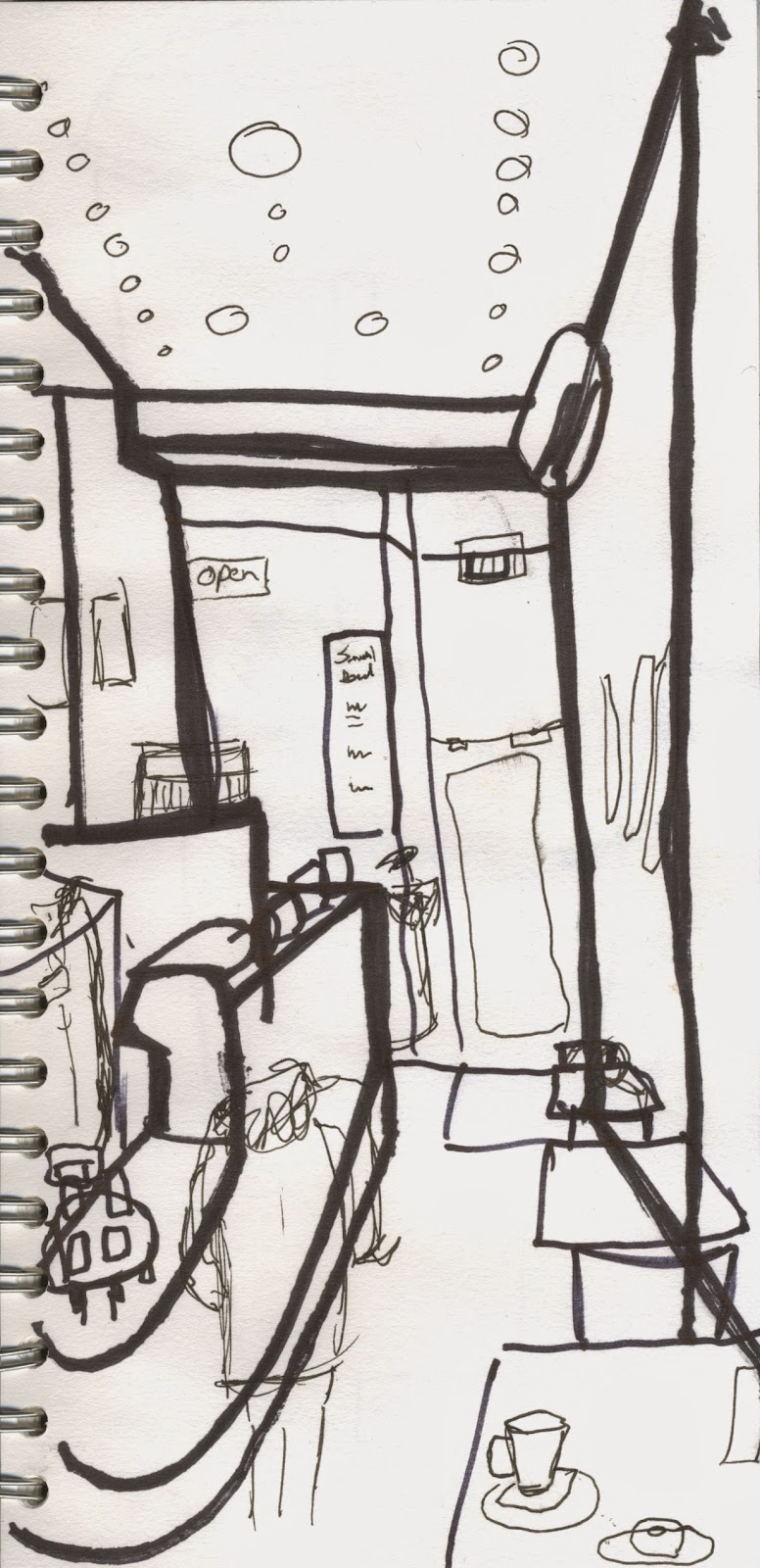
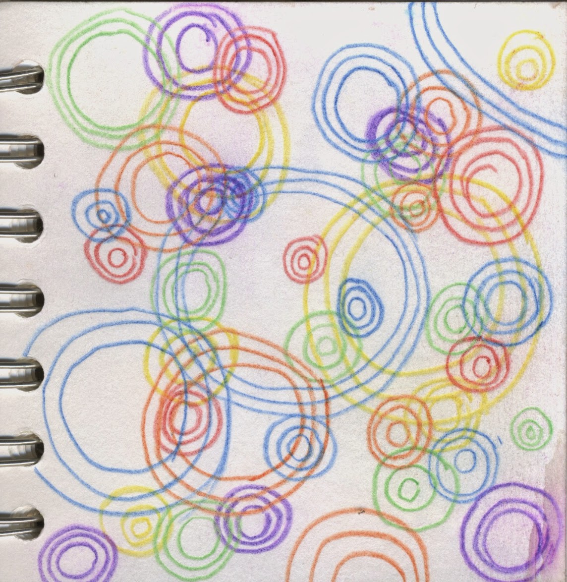
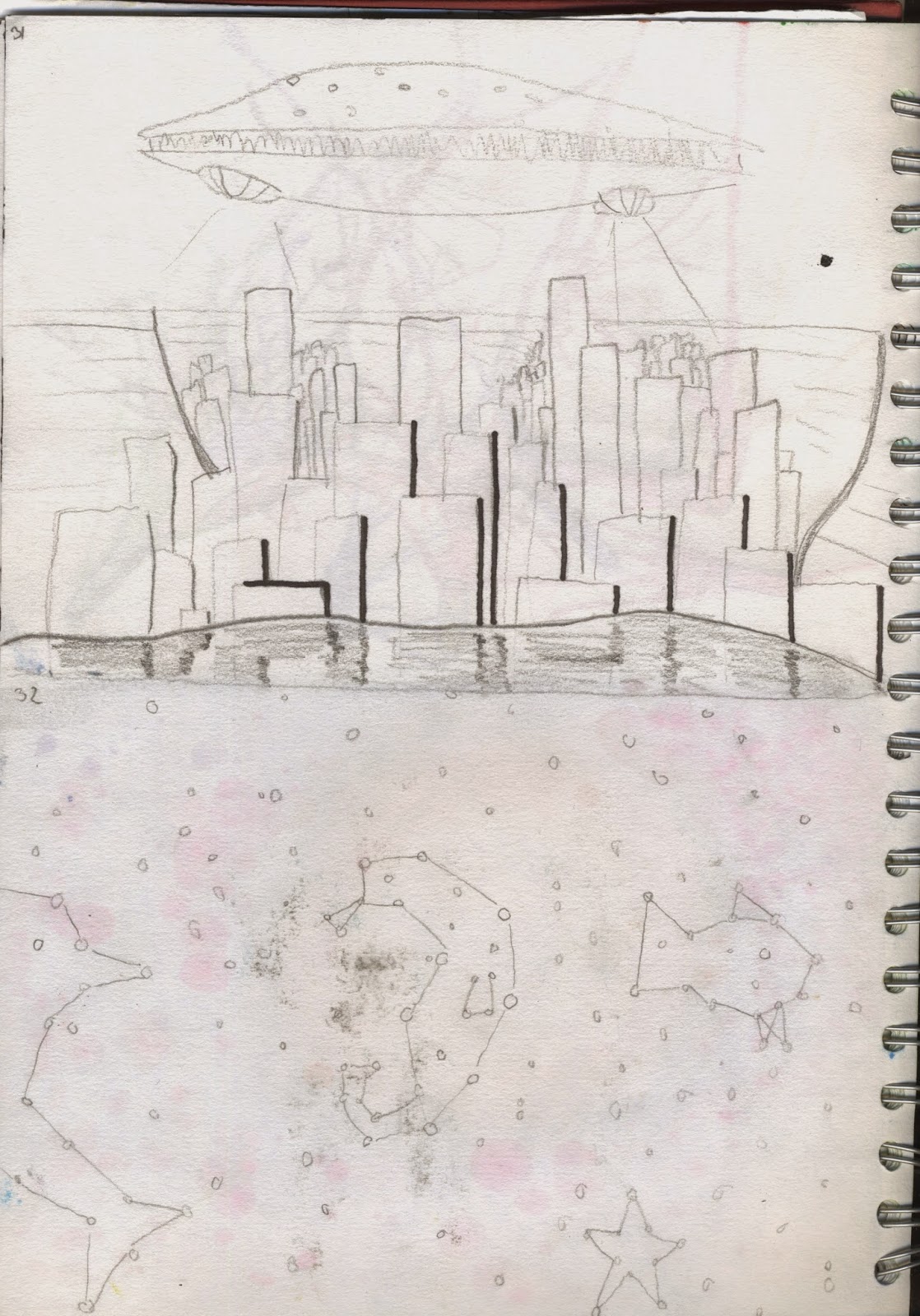
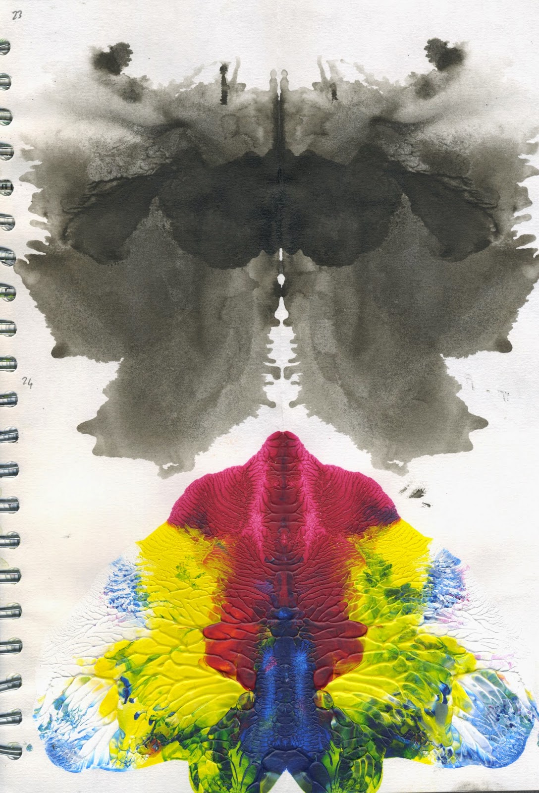
Theres are the images i produced for our environmental storytelling. The three locations i chose were coffee shops, canals and Oscars Flat. I chose these locations because i thought i could produce some interesting images from them, i am particularly proud of my coffee shop images. I eventually gave in to my vice of doodling a little in some of my images but since i was still in the locations at the time i feel it still had an influence of the doodles i produced. I also tried out a bunch of different sketchbook sizes ranging from a large square one the size of an A4 sketchbook but square, a tiny square sketchbook that easily fits into pockets and a long rectangular one that was the length of an A4 sketchbook but the width of an A5. It was fun to try out each one and i prefered the larger square sketchbook until i realised it wouldnt fit into the average sized scanner. As of this moment i am unsure which i prefer but i feel i know what to expect from these shaped sketchbooks in the future.
Wednesday, 18 February 2015
Visual Language 4: Sequence
Here is the sequence of images that i created for the sequence part of the set, series and sequence brief. I chose to tell the story of my robot character being found and repaired, then her eventual leaving to go to space. In all honest i'm quite sick of this character and am happy to see the end of it. I kept using multiple media because i enjoy the variation of styles that come from it.
Tuesday, 10 February 2015
Titles 2: Which Book?
Visual Language 3: Series
Below are the images i created for the series part of the brief. I chose the image i drew of the feminine robot the experiment with. I started off well using different materials for each image however due to the fact i had been experimenting a lot before starting the series part of the module anyway i found myself burnt out very quickly and my last three images i find quite disappointing due to the fact they are all pencil drawings and all a lower quality to my other images.
Visual Language 2: Set
Here are the 32 images that i have created for the set part of the brief. Overall i am quite proud of the images i have produced, though there is a noticeable drop in quality nearer the end where both the incoming deadline and the lack of inspiration really took its toll. however i am very happy with the amount of experimentation produced throughout these images. I tried to keep an open mind in regards to the subjects i drew/painted, rather than focusing on specific subjects like some of my peers i tried to also look at patterns, textures and layouts. I also tried some new techniques that i wouldn't consider otherwise, such as automatic drawing.
Monday, 9 February 2015
Titles 1: Why Titles?
For this module we had the option to pick a brief from 3 options. The Options were;
Brief 1: idents - Pick two TV channels to do a 20 second animated ident for each. We could choose from; E4, Cbeebies, BBC 4 and Discovery Channel to do idents for.
Brief 2: Title - Pick a book that doesn't already have a film adaption to do a 30 second animated title sequence.
Brief 3: Campaign - Choose from either Amnesty International or Childline to develop a 30 second animation to raise public awareness for each charity.
I chose Brief 2 out of the three because i feel like i will be doing a lot more brief like 1 and 3 in my earlier career as an animator and felt i could use the opportunity to do something i think i would find really fun. Furthermore Brief 3 sounded especially dull and depressing as there is already a surefire way to create effective charity animations and i wanted to experiment a bit more.
Subscribe to:
Comments (Atom)


